Preview image. Unlock full-res
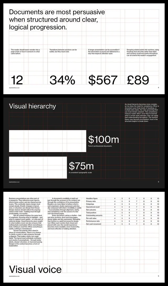
Multi-slide deck demonstrating structured data visualization using grids, large metric displays, and explanatory text with strong typographic hierarchy.
Summary
Presentation deck with black and white palette, organizing financial data through large bold metric callouts, tabular grids, and explanatory caption text arranged on transparent backgrounds.
Visual description
Three-slide composition. Top slide: light background with dark sans-serif headline ("Documents are most persuasive...") followed by a gridded table with four prominent metrics displayed large (12, 34%, $567, £89). Middle slide: dark background with "Visual hierarchy" heading in white, accompanied by two white rectangular blocks of varying width (labeled $100m and $75m) with explanatory copy. Bottom slide: light gray background with dense body copy on the left and a data table on the right (rows: "Headline figures", "Operational result", "Net outcome", etc. with numeric ratings 4-10 across columns). All typography in clean, tight sans-serif. Ample white space around key numbers. Faint grid lines visible behind content areas.
Key takeaway
Oversizing metrics to 2-4x body text height makes them instant focal points. Pairing large numbers with single-word descriptors below (e.g., "Extraordinary result") is faster than full sentence captions. A minimal grid used subtly (as a faint background) organizes dense content without cluttering. Dark/light alternation across slides keeps long decks from feeling monotonous.
Reuse notes
Use for investor pitches, board reports, and research findings where data credibility is primary. The monochrome/near-monochrome palette suits conservative industries (finance, pharma, consulting). Not suitable for creative or lifestyle work. Consider adding a single accent color (e.g., subtle green/red for positive/negative metrics) if needed to break monotony.
More like this



Keep what you find
A free account saves references to boards and can send you a weekly email of picks based on what you save.
To see every result, go Pro.