Preview image. Unlock full-res
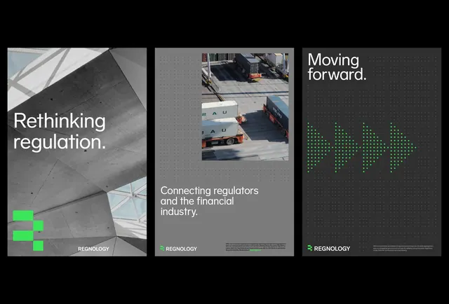
A three-panel corporate brief layout pairing monochromatic photography, geometric shapes, and clean typography with a single lime-green accent point, evoking modern financial or regulatory communication.
Summary
A three-panel corporate layout combining monochromatic photography and geometric blocks with clean sans-serif titles, unified by a single lime-green accent and a neutral gray palette.
Visual description
Three equal vertical panels on dark background. Left panel: gray-toned, high-contrast photograph of angled steel or architectural details with the headline "Rethinking regulation" in sans-serif; a small bright-green geometric shape (cross or plus) sits in the lower left. Center panel: stacked photographs of people and vehicles (shipping/logistics theme) with the subheading "Connecting regulators and the financial industry." Right panel: a large, soft-edged geometric shape (rounded square or blob) centered on gray, no text. All text is left-aligned and flush sans-serif; the lime-green accent is the only chromatic break against the grayscale palette.
Key takeaway
The strategic use of a single bright accent (lime green) anchoring a monochrome, ultra-professional grid. The combination of documentary photography with geometric abstract shapes as a visual contrast. The three-panel format as a flexible system for introducing a business concept (problem, solution, result or approach, context, outcome).
Reuse notes
Strong template for fintech, regulatory, B2B, or consulting briefs. The monochromatic photography reads serious and trustworthy; the green accent works as an energy point without compromising tone. The geometric shapes add visual interest while staying minimal. Works at both presentation scale and as a web/print reference card.
More like this




Keep what you find
A free account saves references to boards and can send you a weekly email of picks based on what you save.
To see every result, go Pro.