Preview image. Unlock full-res
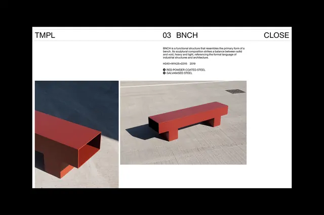
A two-column product presentation layout featuring red geometric benches on contrasting backgrounds, paired with muted typography and architectural photography.
Summary
A product presentation featuring two red benches photographed in high contrast against a monochromatic and gradient background, emphasizing form through shadow and industrial simplicity.
Visual description
A horizontal presentation layout split into two sections. Left side: a red geometric bench photographed against a muted dark blue-gray background, strong side lighting casts a deep shadow creating dimensionality. Right side: the same or similar red bench on a light beige background under bright natural light, shadow rendering underneath. Text appears in the center-top as minimal typography and labels: "TMPL 03 BNCH CLOSE" in a clean sans-serif, with smaller descriptive copy beneath. The benches are rectilinear, appearing to be tubular or solid metal frames painted a consistent rust-red. The contrast between dark and light halves of the layout emphasizes the form and material quality through lighting rather than color variation.
Key takeaway
The use of opposing lighting conditions on the same product to demonstrate form and materiality without relying on color. The symmetrical two-column layout with product flanking centered text creates balance and focus. The minimal typography applied as labels rather than narrative keeps the design uncluttered and lets the product photography speak. The muted color palette prevents competition with the featured product.
Reuse notes
Effective for product catalogs, furniture portfolios, or industrial design presentations where material and form matter more than narrative. The high-contrast approach works well for B2B or premium positioning. Pair with restrained, confident typography and avoid secondary imagery. Works best when products have strong silhouettes or geometric clarity.
More like this

Keep what you find
A free account saves references to boards and can send you a weekly email of picks based on what you save.
To see every result, go Pro.