Preview image. Unlock full-res
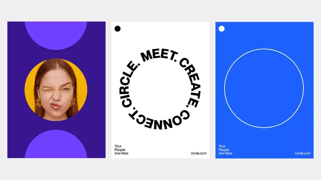
Vibrant community platform branding system balancing deep purple and bright cobalt with circular motifs representing connection and community membership.
Summary
Circle.com's brand toolkit uses vibrant jewel-tone blocking and circular framing to signal community connection. Three distinct compositions show how the brand handles product photography, abstract identity, and membership messaging.
Visual description
Left panel: deep indigo background with a large purple circle, containing a circular cropped portrait of a person with amber earrings, set within a golden-yellow ring. Right panels: bright cobalt background with centered white circle outline (left) and dark navy circle at top-left (right), each anchored by the copy "Your People Are Here" and circle.com branding. All compositions use near-perfect circular or semi-circular shapes and stark, high-contrast color separation. The typography is bold, all-caps sans-serif, arcing along the circles in the center panel.
Key takeaway
The strategic use of the circle as both compositional anchor and semantic symbol for community. The vibrant color blocking (purple with amber accents, bright cobalt with white outlines) creates psychological warmth and trust. The modular three-panel approach shows how a single design system flexes for different use cases (portrait, text focus, empty circle) without losing coherence.
Reuse notes
Strong for community, social, and membership platforms that want to feel approachable yet professional. The color palette translates well to SaaS and nonprofit brands. The circular framing is particularly effective for avatar/portrait contexts. Works best at scale where the color blocking is unambiguous.
More like this




Keep what you find
A free account saves references to boards and can send you a weekly email of picks based on what you save.
To see every result, go Pro.