Preview image. Unlock full-res
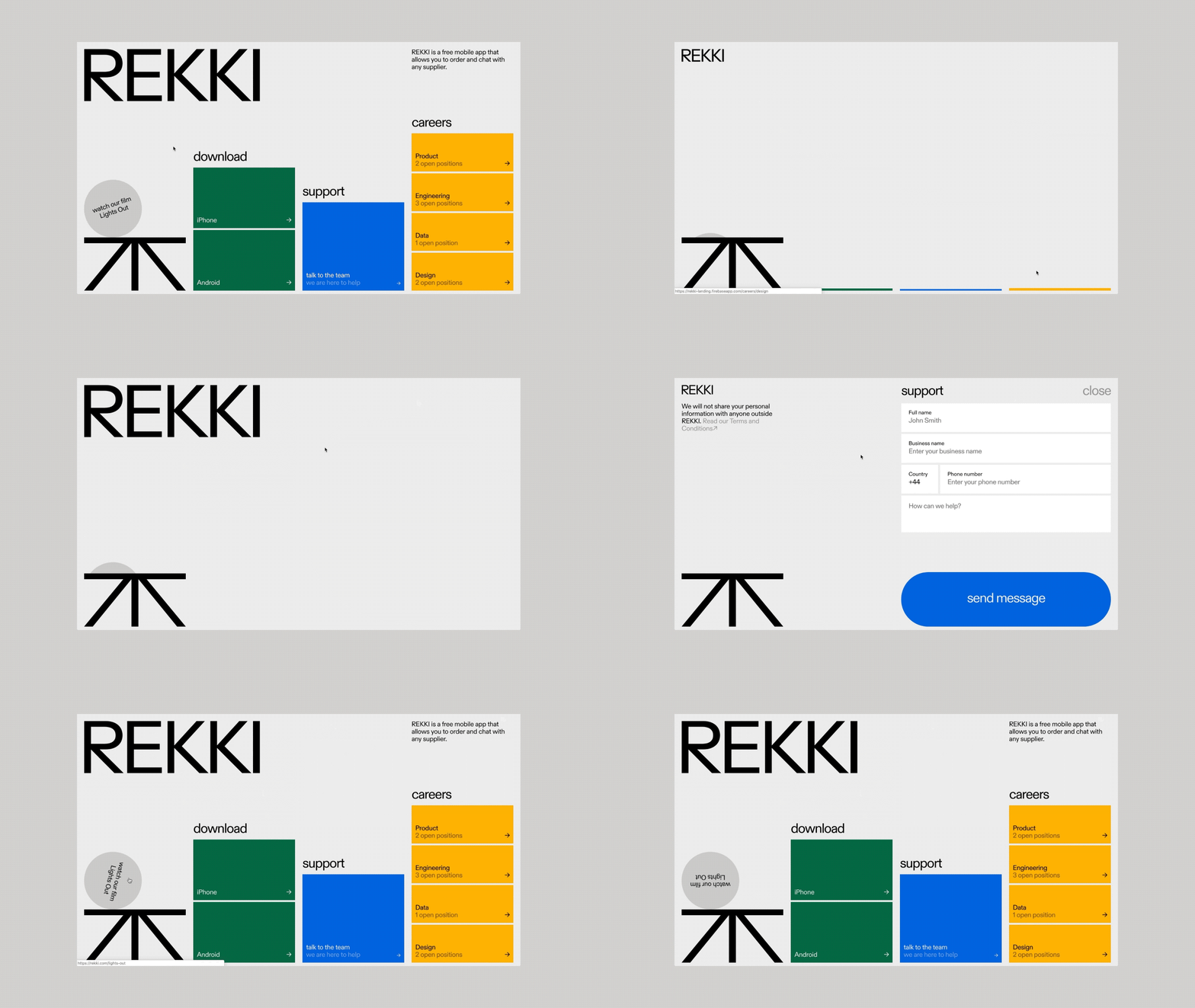
A mobile app interface with a stark white background, segmented colored blocks for download and support options, and a bold sans-serif brand mark.
Summary
A mobile app interface for REKKI (supplier ordering platform) organized into color-blocked sections for download, support, and careers, with a bold sans-serif brand identity.
Visual description
A flat, grid-based interface design on a light gray background. The top left shows the REKKI wordmark in a bold, geometric sans-serif typeface. A circular badge in the bottom left reads "watch our film Lights Out" as a secondary callout. The layout organizes information into vertical columns with colored blocks: a green "download" section listing iPhone and Android; a blue "support" section with "talk to the team / we are here to help"; and a right-side yellow "careers" column showing job categories (Product, Engineering, Data, Design) with open position counts. Each section uses flat color blocks in dark green, bright blue, and golden yellow, with white sans-serif type for labels and descriptions. Arrows indicate actionable items. The overall structure is hierarchical and scannable.
Key takeaway
The use of distinct color zones to organize and prioritize different actions within a single view. The clear hierarchy created by type size, color weight, and spacing guides users through multiple calls-to-action without overwhelming. The bold, condensed wordmark grounds the entire layout with strong branding presence.
Reuse notes
Excellent reference for mobile app navigation, software onboarding, or recruitment landing pages that need to surface multiple pathways. The color-blocking technique works especially well for technical/developer-focused products where clarity and structure are valued. The recruitment-focused "careers" sidebar demonstrates a smart way to promote hiring within product interface.
More like this






Keep what you find
A free account saves references to boards and can send you a weekly email of picks based on what you save.
To see every result, go Pro.