Preview image. Unlock full-res
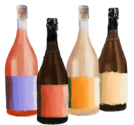
Four product bottles with flat-color label bands in complementary hues: coral-to-purple, rust-to-coral, orange, and brown-to-cream.
Summary
Four photorealistic bottles with solid-color label bands in a carefully coordinated palette: coral-purple, rust-coral, orange, and brown-cream, each complementary pair creating visual interest without ornament.
Visual description
Four realistic glass bottles arranged in a grid, each with a full-height flat-color label band. The labels use bold, high-contrast hues: the first bottle pairs coral on top with purple below the label line, the second combines rust-red with coral, the third is solid orange, and the fourth is brown-to-cream. All bottles share identical form, foil cap, and clear glass showing liquid inside. The arrangement is clean and symmetric against a white background, emphasizing the label color strategy.
Key takeaway
The deliberate complementary-color pairing strategy (warm-cool splits within each label) that makes a minimal, two-tone approach feel sophisticated. The use of solid bands rather than gradients for clarity and flatness. The consistent bottle form isolates color as the design variable.
Reuse notes
Strong reference for beverage branding, craft spirits, or any product line where color differentiation matters. Works when you need distinctiveness without decoration or applied imagery. The palette balances warm (coral, orange, rust) and cool (purple, brown-cream) without clashing.
More like this


Keep what you find
A free account saves references to boards and can send you a weekly email of picks based on what you save.
To see every result, go Pro.