Preview image. Unlock full-res
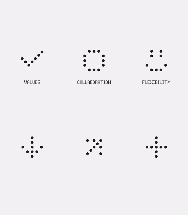
Six abstract dot-based icons arranged in a 3x2 grid, each formed from simple black dots to represent business values like collaboration, flexibility, and growth.
Summary
Six abstract dot-based icons arranged in a 3x2 grid, each formed from simple black dots to represent business values like collaboration, flexibility, and growth.
Visual description
Light gray background with six icon-label pairs evenly distributed in a 3x2 grid. Each icon uses small solid black circles arranged in geometric patterns: a diagonal ascending line (values), a hollow square (collaboration), a diamond (flexibility), a starburst (growth), a scattered pattern (adaptability), and a plus sign (innovation). Below each icon sits a monospaced sans-serif all-caps label in black, aligned center. The dot-matrix approach creates a technical, systematic aesthetic while remaining friendly and readable.
Key takeaway
Dot matrices reduce icons to their simplest geometric essence, making them universally recognizable and easily scalable. The monospace typeface creates a technical, systematic impression while the playful dot patterns feel approachable. This method scales effortlessly across different sizes and mediums without detail loss.
Reuse notes
Perfect for organizational value systems, tech company cultures, or business consulting materials where six distinct concepts need clear, modern visual language. The black-on-light palette ensures legibility in print and digital. Label placement below creates strong grid alignment, ideal for white papers or brand guidelines. Pair with institutional sans-serif type for corporate credibility.
More like this




Keep what you find
A free account saves references to boards and can send you a weekly email of picks based on what you save.
To see every result, go Pro.