Preview image. Unlock full-res
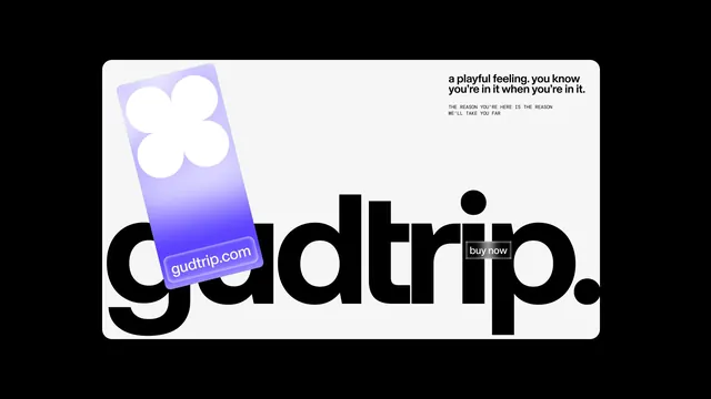
Playful brand presentation combining a gradient-purple phone illustration with white cloud-like emoji element, bold black wordmark, and minimal supporting copy on white card against black background.
Summary
Gudtrip brand identity showcased on a rounded-corner white card featuring a stylized gradient phone mockup with rounded cloud shapes, the brand name in bold black sans-serif, and a playful brand voice statement on a pure-black background.
Visual description
White rounded-rectangle card dominates the composition centered on a black background. Upper left displays a tilted mobile phone illustration with purple-to-white gradient fill and oversized white rounded blob shapes (evoking clouds or playful emoji forms) overlaying the upper third. The Gudtrip logotype in heavy black sans-serif sprawls across the lower half, with the website domain "gudtrip.com" embedded inside the "p" in a smaller lavender label. Top right corner carries a small "buy now" button. Upper right reads two lines of body copy in black sans-serif: "a playful feeling, you know you're in it when you're in it." followed by smaller caps text "THE REASON YOU'RE HERE IS THE REASON WE'LL TAKE YOU FAR." A small black dot appears as a secondary accent element.
Key takeaway
The phone mockup with gradient fill and simple geometric shapes (clouds) as a brandable graphic element that avoids realism while remaining recognizable. The playful tone conveyed entirely through typography hierarchy, spacing, and minimal emoji-adjacent forms rather than illustration. The wordmark scale and weight creating composition with minimal supporting elements.
Reuse notes
Excellent for consumer apps or travel/lifestyle brands wanting a approachable, modern aesthetic without relying on character illustration. The gradient phone works as a brand signature across multiple touchpoints. The playful statement of intent in supporting copy aligns well with personal-brand or direct-to-consumer marketing. White-on-black presentation is high-impact for digital galleries and social teasers.
More like this





Keep what you find
A free account saves references to boards and can send you a weekly email of picks based on what you save.
To see every result, go Pro.