Preview image. Unlock full-res
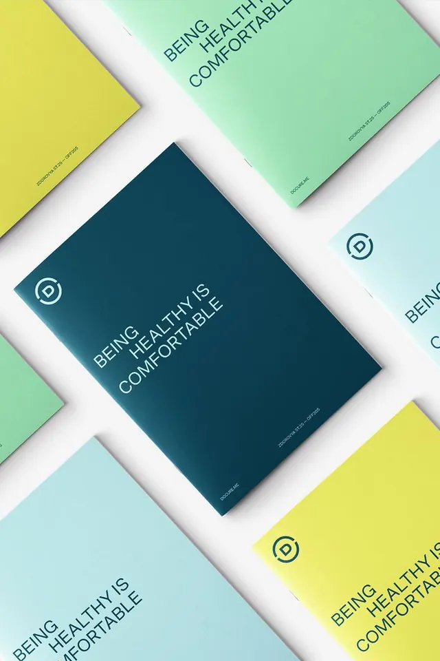
Overlapping branded cards arranged diagonally in vibrant, complementary colors with consistent sans-serif typography and circular logo system.
Summary
A brand identity system composed of four rectangular cards arranged at 45-degree angles, each printed in a different vibrant color with consistent typography and a small circular emblem.
Visual description
White background. Four colored rectangular cards overlapping and tilted diagonally: dark teal, mint green, light cyan, and bright lime yellow. Each card bears the same white sans-serif message in all-caps: "BEING HEALTHY IS COMFORTABLE" with generous word spacing. A small circular logo mark appears in the top-left corner of each card in white. All cards share the same proportions and positioning of text. The diagonal arrangement creates visual rhythm and depth, with cards partially obscuring one another, and the color variety suggests a modular, flexible system suitable for multiple branded touchpoints.
Key takeaway
The use of a diagonal 45-degree composition to convey motion and modernity while maintaining strict visual discipline through consistent color blocking and typography. A small, repeated circular mark anchors the system and becomes instantly recognizable. The pastel-and-bold complementary palette (yellow with teal and cyan) signals contemporary, eco-forward branding without requiring imagery or complex illustration.
Reuse notes
Ideal for sustainability-focused, wellness, or eco-conscious brands that need versatility across stationery, packaging, or digital applications. The modular card system works well as templates for collateral. The bright lime-yellow against cool teals suggests environmental freshness and energy. The system is translatable to various material scales, from business cards to posters. Pairs well with minimal sans-serif body copy and product photography.
More like this









Keep what you find
A free account saves references to boards and can send you a weekly email of picks based on what you save.
To see every result, go Pro.