Preview image. Unlock full-res
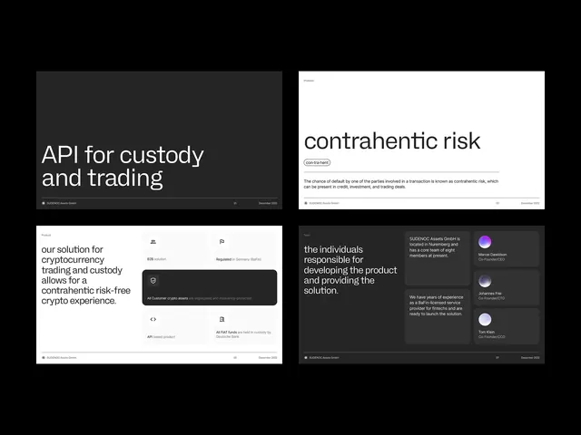
Four fintech dashboard interface mockups in dark and light modes showing trading, custody, and risk management UI patterns.
Summary
Four fintech product dashboard mockups presented side-by-side, alternating dark and light themes with monochromatic typography and structured data layouts.
Visual description
A 2x2 grid of fintech dashboard screens. Top-left (dark theme): headline reads "API for custody and trading" in white sans-serif over charcoal background. Top-right (light theme): clean white card with "contrahentic risk" as a headline, body copy below. Bottom-left (dark): multi-card layout showing "our solution for cryptocurrency trading and custody" with nested text blocks and icon placeholders. Bottom-right (dark): content section labeled "the individuals responsible for developing the product and executing the solution" with icon and text zones. All screens use grid-based layouts with generous padding, uniform typography, and high contrast text/background. A single accent purple dot appears in one lower-right card as the sole color beyond black and white.
Key takeaway
Strict monochromatic approach builds credibility in fintech/crypto contexts. Dark mode + light mode paired presentation shows accessibility thinking. Grid-based card structure makes complex data (APIs, trading products, risk) feel navigable. Minimal accent color (single purple dot) draws focus without distraction. Balanced negative space and left-aligned text blocks support readability over visual noise.
Reuse notes
Excellent reference for fintech, crypto, and payments platforms. The dark/light pairing is useful when designing for both presentation and actual product usage. Card-based structure works well for product feature comparison or API documentation layouts. Best paired with technical copy that explains complex concepts clearly.
More like this
Keep what you find
A free account saves references to boards and can send you a weekly email of picks based on what you save.
To see every result, go Pro.