Preview image. Unlock full-res
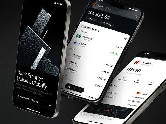
Dark-mode mobile app mockups for a global banking platform featuring high-contrast transaction lists, account balances, and a marble texture hero screen in black and white.
Summary
Dark-mode banking app system with stark white text on pure black, showing onboarding hero, transaction dashboard, and payment screens designed for secure, high-contrast financial clarity.
Visual description
Four smartphone screens arranged in perspective view against a dark reflective surface. Left screen displays a black hero section with white headline "Bank Smarter. Quickly. Globally." and supporting copy, plus an abstract white geometric marble-texture graphic suggesting innovation and security, with a right-pointing CTA arrow. Center-left shows a dashboard with user name "Natali Smith," large white balance amount "$4,923.82," and stacked transaction items (Starbucks, PayPal, Walmart, Netflix, Apple Store) in white text with transaction amounts in green for incoming and red/white for outgoing, each with a branded merchant icon on the left. Center-right screen is nearly identical with Netflix charge "-$15.99" prominently shown. Right screen shows a detailed transaction receipt with Netflix branding, specific date, amount, card payment method, and save/share options in white text on black. All screens use pure black backgrounds with white sans-serif type, merchant logos provide the only color, and spacing is generous to reduce cognitive load on financial information.
Key takeaway
The relentless high contrast and spacious layout make complex financial data readable at a glance. Using only merchant logos and simple red/green affordance for transaction direction creates an instantly scannable transaction list. The marble-texture hero graphic adds visual interest to the onboarding without compromising trust or clarity. The sans-serif headline and clean typography system feels premium without being decorative.
Reuse notes
Essential reference for fintech, banking, investment, and payment products where security, clarity, and rapid information scanning are non-negotiable. The dark mode works across all ambient light conditions and reduces eye strain during repeated app usage. Works well for both retail and institutional banking. Consider the conservative palette if you need to feel premium and trustworthy; avoid adding secondary colors unless they serve a critical affordance function (like red/green transaction amounts).
More like this


Keep what you find
A free account saves references to boards and can send you a weekly email of picks based on what you save.
To see every result, go Pro.