Preview image. Unlock full-res
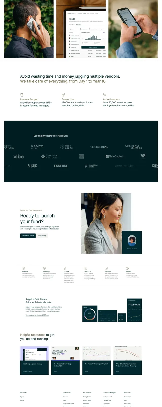
A full landing page for a venture capital fund management platform combines clean white space, teal-dark branding, and subtle photography to establish trustworthiness.
Summary
A venture-capital platform landing page uses a teal-and-white palette, generous whitespace, and integrated product screenshots to position fund management as accessible and trustworthy.
Visual description
Full-page layout with header navigation (logo, Product, Pricing, Resources links, Sign In button). Hero section features bold headline "One partner for all your venture needs" with supporting copy and two call-to-action buttons. Three card images below show use cases (phone conversation, desktop dashboard, mobile app in hand). A value-proposition section lists three benefits with icon support. A dark teal band displays investor/partner logos in grayscale. A secondary CTA section with left-aligned photograph of professional woman and right-aligned dark teal card with profile photo. A six-column features grid with icons and labels follows. Footer with links and social icons. Consistent sans-serif typeface, primarily white backgrounds, dark teal (#001D21) accents, warm tan/brown tones in photography, high contrast throughout.
Key takeaway
The color restraint (white, dark teal, warm neutrals) creates sophistication without visual noise; investor logos rendered as teal silhouettes convey trust while maintaining design elegance; generous whitespace around content makes dense information digestible; mixing lifestyle photography with interface screenshots anchors abstract product to real use.
Reuse notes
Strong template for fintech, B2B services, or enterprise SaaS targeting institutional buyers. The teal-white-tan palette reads as trustworthy without being generic corporate. Logo section credibility is essential for VC or consulting pitches. Works well when you have strong use-case photography and investor relationships to highlight; less effective for consumer products or playful brands.
More like this






Keep what you find
A free account saves references to boards and can send you a weekly email of picks based on what you save.
To see every result, go Pro.