Preview image. Unlock full-res
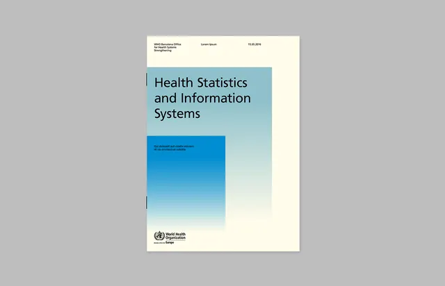
Official health document cover combining a cream letterhead band, teal gradient color block, and bold sans-serif title with WHO logo.
Summary
Official publication cover using a gradient color block technique: pale cream letterhead zone transitions into a teal-to-sky gradient panel holding bold sans-serif title, anchored by institutional logo.
Visual description
White-bordered outer frame on gray background. Interior: pale cream top band with letterhead elements (organization name, date, small ornamental line), shifting into a teal-to-light-blue vertical gradient rectangle. Within the gradient, black sans-serif title "Health Statistics and Information Systems" positioned left-aligned. Below the title, a smaller text block in white on the deepest teal. Bottom section of the gradient fades from teal to pale sky-blue, maintaining visual continuity. WHO logo and "Europe" text appear centered at the bottom on cream. Subtle left-edge accent line in teal frames the layout. Printed-matter aesthetic with tight margins and structured grid.
Key takeaway
The vertical gradient color block as a layout divider and visual anchor. Cream letterhead transitions cleanly to colored content area without jarring shifts. Layering text in varying sizes and colors (black on white, white on teal) maintains hierarchy through color logic, not just size. Simple geometry conveys institutional authority.
Reuse notes
Strong foundation for healthcare, nonprofit, and government publications. Gradient direction can shift to horizontal. Works best with 2-3 color transitions. Cream and teal combination feels approachable yet professional. Pair with serif or sans-serif body text. Translates well to digital and print.
More like this



Keep what you find
A free account saves references to boards and can send you a weekly email of picks based on what you save.
To see every result, go Pro.