Preview image. Unlock full-res
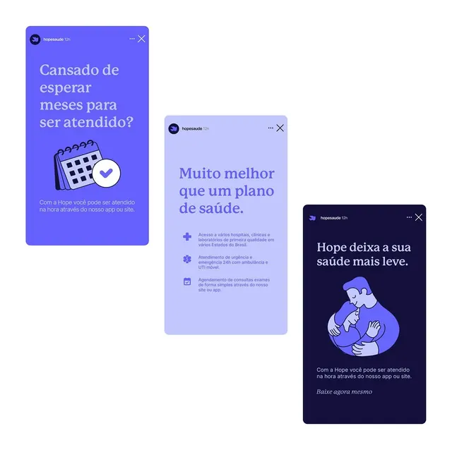
The design utilizes a clean, modern aesthetic with a focus on user trust and clarity, employing soft blues and purples to convey a sense of calm and professionalism.
Summary
The design utilizes a clean, modern aesthetic with a focus on user trust and clarity, employing soft blues and purples to convey a sense of calm and professionalism.
Visual description
A collection of card-based UI elements in muted indigo and lavender tones on white. Cards feature clear sans-serif headlines in display weight, supported by body copy lines in smaller text. Icons (simple line drawings of calendars, medical symbols, and people) accompany each section, rendered in matching indigo. The layout emphasizes generous white space, minimal borders (mostly soft blue outlines), and left-aligned text. Color shifts subtly across cards from bright lavender to dark navy, creating visual hierarchy without visual clutter.
Key takeaway
The soft indigo-to-lavender palette progression is soothing yet modern. Simple icons paired with clear headlines create instant scanability. The card structure with ample padding and white space feels spacious and trustworthy, not cramped or clinical.
Reuse notes
Ideal for healthcare, insurance, or patient-facing SaaS products where calm and clarity are paramount. Works well for feature comparisons, benefits lists, or onboarding sequences. The cool color palette is especially suited to health tech and wellness contexts.
More like this



Keep what you find
A free account saves references to boards and can send you a weekly email of picks based on what you save.
To see every result, go Pro.