Preview image. Unlock full-res
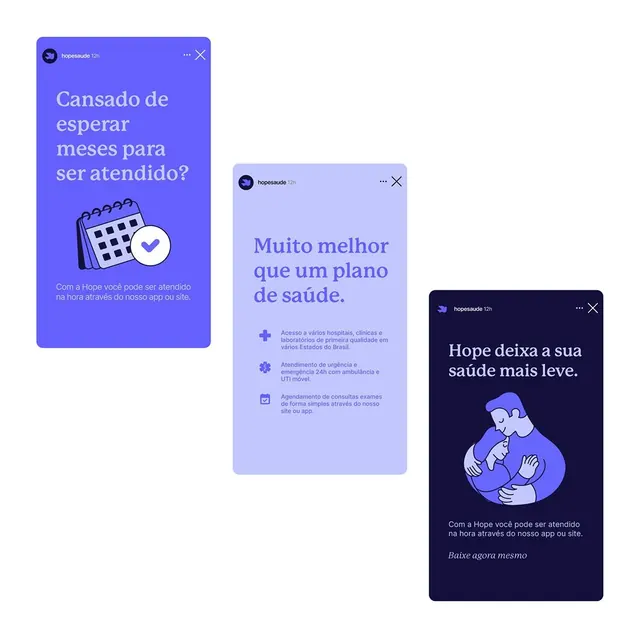
Three stacked mobile card UI screens promoting a Brazilian healthcare app (Hope), with layered blues and purples, illustrative icons, and multi-line body copy in Portuguese explaining booking and plan features.
Summary
Three stacked mobile card UI screens promoting a Brazilian healthcare app (Hope), with layered blues and purples, illustrative icons, and multi-line body copy in Portuguese explaining booking and plan features.
Visual description
Three mobile-format cards (portrait 16:9ish, rounded corners) overlapping and cascading from left to right, each a different shade within the cool indigo-to-lavender spectrum. The leftmost card is bright indigo with white display type asking "Cansado de esperar meses para ser atendido?" (Tired of waiting months for care?) below a flat icon of a calendar with a checkmark. The center card is light lavender with icons for hospitals, emergency care, and booking, set in smaller sans-serif body copy. The rightmost card is deep navy with a flat illustration of an embracing couple in lavender and white, with supportive tagline copy. All typography is clean sans-serif in white, stacked left-aligned. The cards sit on neutral background with soft shadow/depth suggesting digital layers.
Key takeaway
The color gradient cascade (dark to light to dark) creates dimensional depth without shadows or borders. Simple, single-focus illustrations (calendar, couple) paired with concise copy lines make each card independently readable. The card-stacking effect with layered positioning suggests a scrollable flow and reduces cognitive load compared to a single dense screen.
Reuse notes
Strong pattern for healthcare onboarding, appointment booking, or insurance-plan comparison flows. The cascading depth works well for mobile UI and guides the eye naturally down the stack. Works best with 2-4 key benefit statements and one supporting icon/illustration per card. The indigo-lavender palette reads calm and trustworthy, fitting for health apps.
More like this


Keep what you find
A free account saves references to boards and can send you a weekly email of picks based on what you save.
To see every result, go Pro.