Preview image. Unlock full-res
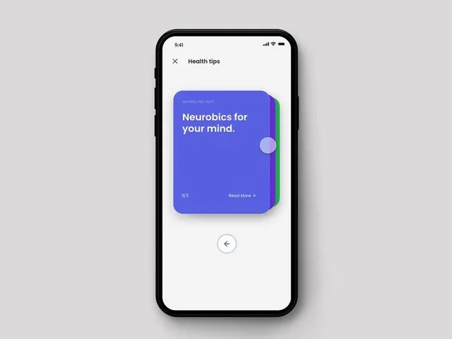
iOS app interface showcasing a card-based carousel for health tips, with a vibrant blue-to-teal gradient card and navigation arrows below.
Summary
An iOS app interface displaying a health-tips carousel with a single card in deep blue-to-teal gradient containing white text, a pale circular accent, and navigation controls below.
Visual description
A light gray iPhone mockup displays a "Health tips" header and a full-screen card carousel. The featured card uses a vibrant blue-to-teal gradient background with white display type reading "Neurobics for your mind," a muted purple circular orb accent on the right edge, and a "Read More" link at bottom left with a step counter "3/5" below. A subtle back-arrow navigation button sits centered underneath the card on the light background. The design prioritizes negative space, clean hierarchy, and readability.
Key takeaway
The gradient-card device with a single accent shape (the orb) creates visual interest without clutter. The carousel step indicator (3/5) is minimally intrusive yet informative. The centered navigation arrow below the content is an effective alternative to traditional swipe-forward prompts, making progression explicit.
Reuse notes
Ideal for health, wellness, fitness, or educational apps where cards deliver bite-sized content. The blue-teal palette suggests calm and trust; swap colors to match your app's personality. Works best with generous padding and single-card-at-a-time focus; less effective in dense list layouts.
More like this





Keep what you find
A free account saves references to boards and can send you a weekly email of picks based on what you save.
To see every result, go Pro.