Preview image. Unlock full-res
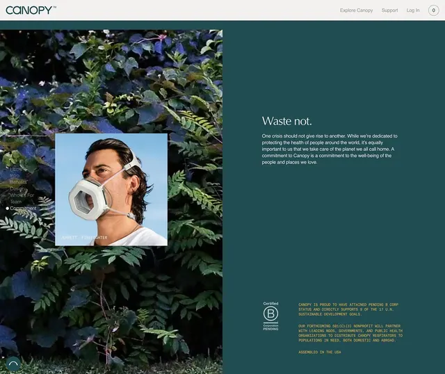
A corporate brand page for Canopy respiratory protection featuring a split-screen layout with lush foliage on the left, a featured product photo of a maskmaker, and mission/certification details on the right.
Summary
A corporate brand page for Canopy respiratory protection featuring a split-screen layout with lush foliage on the left, a featured product photo of a maskmaker, and mission/certification details on the right.
Visual description
Left side shows close-up photography of vibrant ferns and foliage in deep greens and blues, creating an organic, natural backdrop. Overlaid on this is a framed photo of a person wearing a white hexagonal respirator, labeled "Benefit of Air Fighter." Right side uses a deep teal background with white and light cream text. The main headline reads "Waste not." followed by a paragraph on environmental responsibility. Below are two certification sections: a B-Corp badge and text describing Canopy's commitment to partnering with nonprofits to distribute respirators. Navigation and logo appear at the top. Typography is clean, sans-serif, and highly legible.
Key takeaway
The environmental photography creates instant brand association and emotional connection without relying on text alone. The framed product shot on the nature background makes the product feel integral to the environmental mission. The teal background communicates trust and sustainability. The B-Corp badge and certification text provide third-party credibility. Clean sans-serif type ensures the mission statement reads clearly against the dark background.
Reuse notes
Effective for mission-driven brands, nonprofits, and social enterprises. The nature-product juxtaposition works particularly well for health, wellness, and environmental categories. The split-layout pattern accommodates both emotional imagery and rational messaging without competing. The deep teal and muted palette convey seriousness and trustworthiness without coldness.
More like this






Keep what you find
A free account saves references to boards and can send you a weekly email of picks based on what you save.
To see every result, go Pro.