Preview image. Unlock full-res
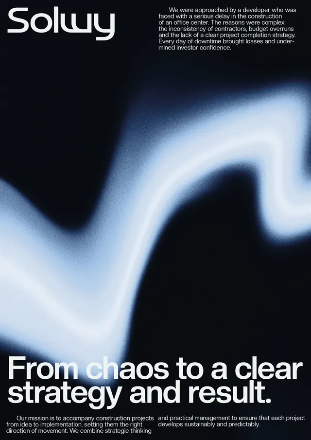
Soluy case study page with left-aligned logo, body text, and flowing wave gradient graphic in cool blue tones.
Summary
A case study layout introducing Soluy construction services with a minimalist composition that pairs body text against a flowing, offset wave graphic in cool blue gradients.
Visual description
Dark navy background with the Soluy wordmark (white, sans-serif) anchored top-left. Justified body text sits above center-right on the same left column, describing a construction project and the client challenge. A prominent organic wave form dominates the right two-thirds of the canvas, rendered in a gradient from dark blue through light cyan to near-white, creating depth through overlapping wave bands. The wave's soft edges suggest motion and flow. Negative space is deliberate and generous, emphasizing the wave's sculptural presence.
Key takeaway
The offset wave technique using only gradient and negative space to break up heavy text without imagery. The careful balance between the dense type block and the expansive abstract form. The cool blue palette signaling professionalism and technical credibility.
Reuse notes
Strong reference for B2B case studies, construction, or enterprise services. The wave is pure CSS gradient or vector, so it scales and prints cleanly. Works best on dark backgrounds with ample whitespace to breathe.
More like this



Keep what you find
A free account saves references to boards and can send you a weekly email of picks based on what you save.
To see every result, go Pro.