Preview image. Unlock full-res
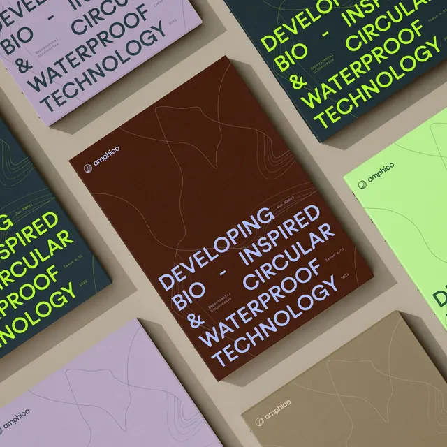
A stack of minimalist publication covers with neon and earthy tones, using diagonal layering and subtle topographic line patterns to suggest science and sustainability.
Summary
A stack of minimalist publication covers for bio-tech or environmental science brands, with neon and earthy tones layered diagonally to suggest depth and rigor.
Visual description
A tilted stack of four printed covers arranged in isometric perspective, each featuring a subtle topographic line pattern in neutral tones (cream, sage, purple, brown). Neon-bright text in yellow-green highlights the primary headline "DEVELOPING BIO & CIRCULAR WATERTECHNOLOGY" across multiple covers. The typography is modern sans-serif, set at large scale. A small rounded logo sits in the top-left corner of the most visible cover. The overlapping, angled composition creates visual momentum and a sense of scientific gravitas through the interplay of muted and bright color.
Key takeaway
The diagonal stacking technique creates depth and visual interest without needing imagery. The restrained earthy palette combined with a single bright accent (neon green) feels both credible and contemporary. The topographic line pattern is subtle enough to not compete with type but distinctive enough to signal technical rigor.
Reuse notes
Strong for sustainability, biotech, or science-adjacent brands where trust and modernity must coexist. Works particularly well as a campaign identity for publications, reports, or research materials. The stacking technique adapts well to physical materials like brochures or packaging.
More like this


Keep what you find
A free account saves references to boards and can send you a weekly email of picks based on what you save.
To see every result, go Pro.