Preview image. Unlock full-res
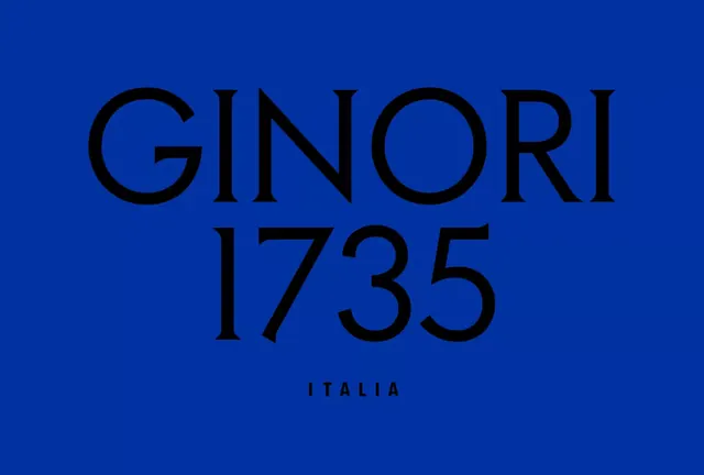
A centered sans-serif institutional wordmark in black serif capitals reading GINORI 1735 ITALIA on a deep saturated blue background, with maximalist letterform weight conveying heritage and authority.
Summary
A centered sans-serif institutional wordmark in black serif capitals reading GINORI 1735 ITALIA on a deep saturated blue background, with maximalist letterform weight conveying heritage and authority.
Visual description
The composition is rigorously centered: a three-line wordmark stack dominates a rich cobalt-blue field. "GINORI" sits on line one in heavyweight serif capitals with open counters, "1735" on line two (the founding year), and "ITALIA" in smaller all-caps serif below. The black letterforms sit with no decorative stroke or border, allowing the weight and spacing of the letters themselves to anchor the design. The deep blue background is uniform and unbroken, intensifying the contrast between the dark letterforms and their field. The result reads as institutional, archival, and historically rooted.
Key takeaway
The year stamp (1735) integrated into the wordmark structure itself is a elegant way to establish heritage without narrative flourish. The high contrast and centered vertical stack are maximally legible at any scale. The serif choice for all-caps wordmarks adds dignity and formality that sans-serif alone cannot match.
Reuse notes
Ideal for heritage brands, wine and spirit labels, luxury goods, and government/institutional identity systems. The blue-and-black palette signals trustworthiness and depth. The centered stack works on product packaging, signage, and archival documents. Avoid for contemporary startup or informal contexts where the formal weight would read dated rather than authoritative.
More like this








Keep what you find
A free account saves references to boards and can send you a weekly email of picks based on what you save.
To see every result, go Pro.