Preview image. Unlock full-res
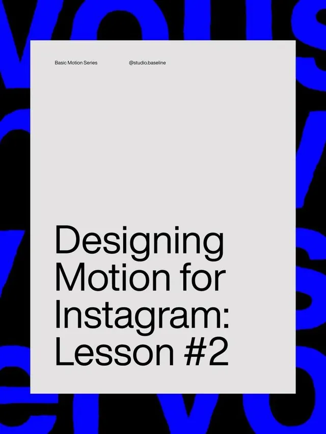
Minimalist tutorial cover with bold sans-serif headline centered on light gray, framed by neon-blue and black abstract organic shapes forming a dynamic asymmetric border.
Summary
Educational design cover for an Instagram lesson featuring large serif-style headline text ("Designing Motion for Instagram: Lesson #2") centered on light gray, with neon-blue and black organic abstract shapes cropping and framing the edges.
Visual description
A light gray rectangular center frame contains a sans-serif headline in black, reading "Designing Motion for Instagram: Lesson #2", with small studio-name and handle text at the top-left (@studio.baseline, Basic Motion Series). The entire composition is bordered by irregular organic shapes in neon blue and black, creating an active asymmetric frame that feels energetic and contained simultaneously. The background shapes don't follow a grid; instead they appear as flowing, overlapping patches that burst inward from all four edges, giving the layout a sense of visual tension without cluttering the central message.
Key takeaway
Neon blue as a high-impact accent color against light gray and black creates immediate visual pop in a digital context. The organic, asymmetric framing keeps the design feel modern and non-rigid; hard geometric lines are replaced with flowing boundaries. The central light rectangle creates a "breathing room" for text while the chaotic border-treatment reassures viewers this is playful instruction, not corporate.
Reuse notes
Ideal for design pedagogy, online course marketing, or social-media lesson cards where you need to signal "this is learning, but dynamic." The blue-on-black-on-light structure works well for thumbnail visibility on Instagram or course platforms. Avoid applying this style to formal or conservative contexts; the intentional dynamism reads as youth-focused and creative-industry oriented. Works best when the central text is genuinely simple and short.
More like this


Keep what you find
A free account saves references to boards and can send you a weekly email of picks based on what you save.
To see every result, go Pro.