Preview image. Unlock full-res
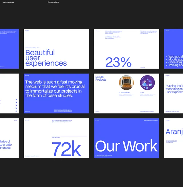
A portfolio-style presentation grid mixing blue case-study slides with white data tiles and purple accent graphics.
Summary
A presentation mockup grid showcasing case studies and metrics using a blue and white color system with purple accent circles.
Visual description
Twelve rectangular tiles arranged in a 4x3 grid against dark charcoal background, each representing a different slide or section. Blue tiles feature white sans-serif headlines and body text, alternating with white tiles containing blue numbers (23%, 72k) and supporting copy. One tile shows two circular diagrams (one gold/orange, one purple with network illustration). The left edge displays "Brand materials" and "Company Deck" labels. Typography is clean, sans-serif, with generous white space. Hierarchy emphasizes large metrics, supporting text in smaller weight, and icons as visual anchors.
Key takeaway
The alternating blue and white tile pattern creates visual rhythm while maintaining readability; large metric numbers act as focal points; modular grid allows flexibility in content without sacrificing cohesion; accent circles provide visual interest without disrupting the minimal aesthetic.
Reuse notes
Strong reference for digital-agency portfolios, marketing decks, and data-heavy presentations. Works well for companies wanting to showcase metrics or case studies at scale. Requires genuinely meaningful numbers and imagery to carry the design weight.
More like this









Keep what you find
A free account saves references to boards and can send you a weekly email of picks based on what you save.
To see every result, go Pro.