Preview image. Unlock full-res
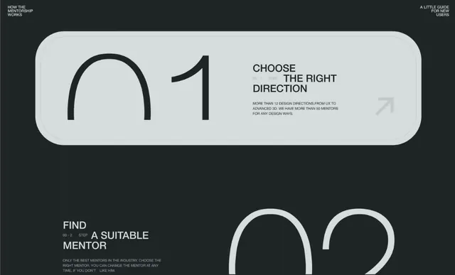
Multi-step onboarding layout with numbered large-digit cards (01, 02) and sequential instructional text against a dark background.
Summary
Multi-step onboarding layout with numbered large-digit cards (01, 02) and sequential instructional text against a dark background.
Visual description
Dark charcoal background with a page header "HOW THE MENTORSHIP WORKS" (top left) and "A LITTLE GUIDE FOR NEW USERS" (top right). First step shows an oversized "01" in a rounded light-gray card (left half) paired with "CHOOSE THE RIGHT DIRECTION" headline and supporting body copy describing 12+ design directions and 50+ mentors. Second step shows "02" partially visible at bottom right in similar card style. Each number and heading use sans-serif type: the large numbers are bold and black; the headings are all-caps and black; the body copy is smaller gray text. Typography hierarchy is extreme, with the step numbers dominating each card, creating a clear visual progression through the sequence.
Key takeaway
The oversized step number (01, 02) as a visual anchor makes each step instantly scannable. The rounded card container containing the number creates visual pause and anticipation. Pairing large numeric identifier with concise all-caps headline and smaller body copy creates three-tier hierarchy that guides comprehension. The dark background ensures the light cards pop without eye strain.
Reuse notes
Excellent for onboarding flows, product tours, mentorship platforms, and educational processes. Works in web, mobile, and print contexts. The extreme typography hierarchy works only when each step has a genuinely distinct action or decision; avoid overusing if steps are roughly equal in importance. Pairs well with icons or illustrations inside the cards to add visual variety across steps.
More like this





Keep what you find
A free account saves references to boards and can send you a weekly email of picks based on what you save.
To see every result, go Pro.