Preview image. Unlock full-res
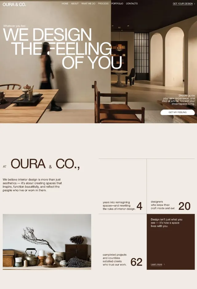
Interior design studio website splitting a warm-toned office interior with split-screen hero and detailed about section showcasing philosophy and credentials.
Summary
Interior design studio website spanning a split-screen hero featuring an office environment with overlaid headline, and a below-the-fold about section presenting the studio's philosophy with photography and statistics.
Visual description
Hero section splits a warm interior photograph of an office space (left) with large white sans-serif headline text overlaid: "Whatever you feel / WE DESIGN THE FEELING OF YOU". A blurred figure walks through the space. The right portion shows another room angle with soft-lit arched doorways and wooden furnishings. A secondary headline reads "Should guide your new experience, one step at a time. Toward your dreamspace living." with a rounded call-to-action button "GET MY FEELING".
Below, the about section uses a beige background with dark brown typography. The site name "OURA & CO." anchors the left side. Three columns of navigation links ("Quick Links", "Other Pages") sit above a grid of link-cards, each with muted mint-green icon backgrounds and sans-serif labels: Homepage, Who we are, Our Services, Plans & Pricing, FAQ, Testimonials, Contact us, Error Page. A left-aligned text block explains the studio's design philosophy. A large lifestyle photograph of decorative ceramics and objects occupies the lower left. Three prominent statistics display designer count (20), years reimagining spaces (4), and completed projects (62).
Key takeaway
The split-screen hero pairing editorial photography with overlaid text creates depth and movement without animation. The muted palette (warm beige, dark brown, soft greens) conveys luxury and craft. The card-based navigation layout with icon badges and secondary copy combines functionality with approachability, ideal for service-driven websites.
Reuse notes
Strong template for service-based design studios, architecture firms, and interior brands. The warm, earthy palette works well for luxury or handmade-focused narratives. The split photography technique pairs well with minimal typography and trust-building copy (philosophy statements, credentials, client count).
More like this

Keep what you find
A free account saves references to boards and can send you a weekly email of picks based on what you save.
To see every result, go Pro.