Preview image. Unlock full-res
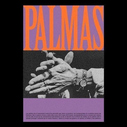
A bold graphic poster combining vibrant orange and purple striped typography against a grayscale photograph of stacked hands, centered between colored bands suggesting music or cultural branding.
Summary
A striking cultural poster pairing the word "PALMAS" in thick, striped orange-and-purple typography with a high-contrast grayscale photograph of hands stacked together, flanked by solid color bars.
Visual description
The composition is divided into three vertical bands: a dark charcoal top third holds the word "PALMAS" rendered in a bold, sans-serif capital typeface with alternating orange and purple horizontal stripes creating a vibrant zebra effect. The center features a grayscale photograph of multiple hands stacked together in an expressive gesture, showing texture and detail through the monochrome treatment. Below sits a solid rectangle of muted purple matching the typography strokes. A thin line of type runs along the bottom in a secondary serif. The overall impression is graphic and direct, with strong pop-art sensibility achieved through strategic color blocking and photographic juxtaposition. The contrast between the dimensional hand photograph and flat striped type creates visual tension and urgency.
Key takeaway
The striped-letter technique transforms simple typography into an architectural element that commands the poster. Pairing high-saturation, complementary colors (orange-purple) with grayscale photography creates maximum contrast. The centered, hand-stacked photograph is immediately recognizable and emotionally resonant for music or cultural campaigns. The solid color band below adds weight and frames the composition.
Reuse notes
Perfect for music event posters, album covers, cultural festivals, or solidarity-themed campaigns where human connection is central to the message. The bold color palette and pop-art approach work well at large scale for print. The striping technique can overwhelm smaller formats, so use at poster size or larger. Avoid for corporate or luxury brands where the intensity would feel wrong.
More like this
Keep what you find
A free account saves references to boards and can send you a weekly email of picks based on what you save.
To see every result, go Pro.