Preview image. Unlock full-res
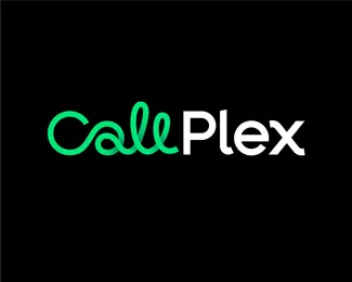
A bold monochromatic wordmark with a geometric curved mark in neon green paired with clean sans-serif white typography on a black background.
Summary
A technology brand wordmark combining a geometric neon-green curved icon with clean white sans-serif type on solid black, creating high contrast and digital-first visual identity.
Visual description
Black background with two elements: a geometric curved mark in bright neon green (#00EE7C) resembling a looped or wave form, positioned to the left, followed by the word "Plex" in clean white sans-serif type. Together they read "CallPlex". The letterforms are modern and geometric, with consistent stroke weight and spacing. The mark functions as both a visual asset and a complementary companion to the typography, suggesting motion, connectivity, or data flow. Negative space is generous, centering the wordmark horizontally with ample breathing room.
Key takeaway
The pairing of a single geometric accent color (neon green) with monochromatic typography creates immediate brand personality without complexity. The curved mark acts as a visual anchor that humanizes and energizes an otherwise stark black-and-white palette. The consistent geometric language between mark and type creates cohesion. The high contrast ensures legibility at any scale and strong presence against any background.
Reuse notes
Excellent model for tech and SaaS brands aiming for modern, digital-first identity. The neon green accent is memorable and works well in dark UI contexts. The simplicity scales perfectly to small sizes (favicons, avatars, mobile app icons) and large scale (signage, hero graphics). Pairs well with dark-mode interfaces. Consider how the accent color reads on secondary backgrounds beyond black (gray, navy) if brand guidelines expand.
More like this





Keep what you find
A free account saves references to boards and can send you a weekly email of picks based on what you save.
To see every result, go Pro.