Preview image. Unlock full-res
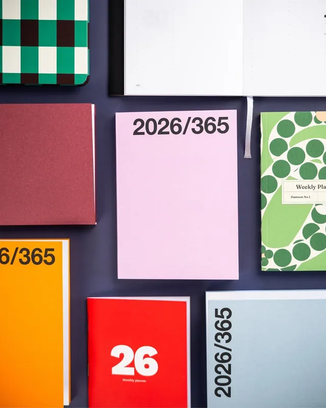
Overhead flat lay of coordinated stationery and planning materials in a complementary color palette arranged on a dark navy background.
Summary
Flat lay composition of color-coordinated planning notebooks and stationery arranged on a deep navy background, demonstrating harmonious complementary color relationships.
Visual description
Overhead arrangement of planning and design materials including a checkerboard-patterned phone case (deep green, cream, burgundy squares) in the upper left; a cream rectangular notebook with dark serif "2026/365" typography centered; a burgundy rectangular card; an orange square with partial "6/365" text; a red card with large white "26" and "Monthly planner" copy; and a green card with repeating white circle pattern and "Weekly Pla..." label. A thin gray ribbon bookmark trails across. The dark navy backing creates strong contrast with the bright, saturated colors of each item. All typography uses clean, modern sans-serif fonts at various scales for hierarchy.
Key takeaway
The deliberate color pairing and complementary contrast creating visual rhythm; the use of pattern repetition (checkerboard, circles) as a unifying system; the layered hierarchy of date labels and typography creating a narrative flow.
Reuse notes
Ideal reference for productivity app interfaces, planner and bullet-journal design, stationery branding, and organizational systems. The flat-lay composition translates well to marketing photography, social-media grids, and product catalogs. Works especially well when targeting creative professionals or time-management audiences.
More like this





Keep what you find
A free account saves references to boards and can send you a weekly email of picks based on what you save.
To see every result, go Pro.