Preview image. Unlock full-res
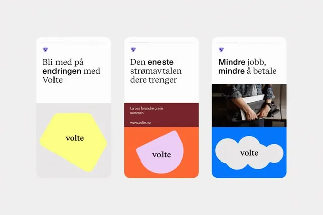
Three-card layout using flat geometric and organic shapes in contrasting colors to organize content around a single brand mark.
Summary
Three modular cards presenting Volte branding, each combining a headline, content area, and a distinct organic or geometric shape in contrasting colors.
Visual description
Three white cards sit side by side on a light gray background. The left card holds a yellow pentagon shape with the word "volte" centered, topped with Norwegian text "Bli med på endringen med Volte" and a small purple triangle icon. The middle card stacks burgundy and orange sections, with the orange area containing a soft pink rounded shape holding "volte" inside; text above notes "La oss forandre greia sammen" with a website reference. The right card combines a black photo (partial figure) with a bright blue base featuring two white organic cloud shapes with "volte" centered. All headers use bold sans-serif type; descriptions use a lighter weight. The palette moves across warm (yellow, orange) to cool (blue) while maintaining high contrast against the white card grounds.
Key takeaway
The modular three-card structure as a content system. The pairing of a large organic or geometric shape with contained text. The move from one warm accent card through a mixed warm-cool pair to a cool card, creating visual progression while staying cohesive through consistent typography and card proportions.
Reuse notes
Effective for product features, service offerings, or brand values when you want each item to feel distinct. Works best with equal-weight cards and a discipline around shape complexity. The organic shapes read softer than pure geometry; scale by emphasis.
More like this







Keep what you find
A free account saves references to boards and can send you a weekly email of picks based on what you save.
To see every result, go Pro.