Preview image. Unlock full-res
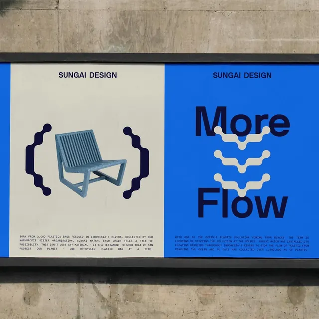
Symmetric two-panel exhibition poster by Sungai Design contrasting a minimal cream furniture illustration (left) against a bold cobalt blue panel with flowing organic typography (right).
Summary
A two-panel exhibition poster that juxtaposes austere Swiss-style geometric furniture lines on cream (left) with expressive, flowing organic text on vibrant cobalt blue (right).
Visual description
Two vertical panels of equal width are positioned side-by-side. The left panel has a cream background and features a line-drawn chair rendered in minimal black strokes, with simple curved bracket elements flanking it. A small sans-serif credit line in black sits at the bottom. The right panel is a bold cobalt blue with white flowing cursive or semi-script typography spelling "More Flow" and additional body copy below in smaller white text. Both panels are labeled "SUNGAI DESIGN" in small black type. The textured concrete or stone visible at the top and bottom frames the composition. The contrast between restrained, geometric left and exuberant, expressive right creates visual tension.
Key takeaway
The deliberate juxtaposition of two opposing aesthetics (minimal vs. expressive) on a single poster unifies them through layout balance and branding. The cobalt on white provides maximum legibility and impact. The furniture illustration shows how line-work alone can convey elegant form. The flowing type on blue reads as premium and contemporary.
Reuse notes
A strong reference for exhibition design, design-adjacent branding, or any brief that needs to show two facets of a practice. The two-panel structure works for before/after, offering split, or philosophy contrasts. Use when you want sophistication plus energy. The cobalt is bold enough to carry weight against the austere left side; avoid muting it.