Preview image. Unlock full-res
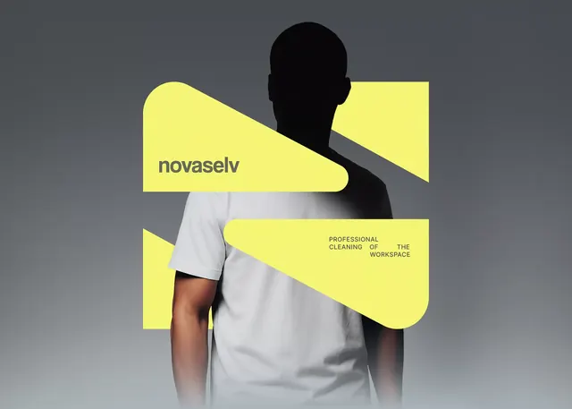
A neon-yellow geometric composition featuring a silhouetted figure with overlapping sharp shapes and bold typography for a professional cleaning brand.
Summary
A neon-yellow geometric composition featuring a silhouetted figure with overlapping sharp shapes and bold typography for a professional cleaning brand.
Visual description
A charcoal background holds a black human silhouette (head and shoulders, faceless) centered in the frame. Three sharp, brightly lit neon-yellow geometric shapes layer dynamically across and behind the figure: one rounded rectangle curves behind the head, a triangular wedge cuts diagonally across the chest, and a larger blocky shape anchors the lower half. The brand name "novaselv" sits in dark gray sans-serif on the upper-left yellow shape, while "Professional Cleaning of the Workspace" reads in small all-caps gray text on the lower-right yellow block. The overlaps create a sense of depth and forward motion despite the flat color palette.
Key takeaway
The neon-yellow shapes acting as both background and text carrier, creating contrast without additional colors. The silhouette strategy lets any brand occupy the figure without losing the geometric energy. Diagonal cuts and asymmetric layering give a modern energy to a traditionally conservative industry (services/cleaning).
Reuse notes
Strong for B2B service brands (cleaning, maintenance, logistics, HR) seeking a contemporary, confident visual. Yellow on dark gray works at any size and prints/screens cleanly. The silhouette approach scales to team hero sections if depth-stacked. Avoid using if the brand identity already emphasizes a specific mascot or face.
More like this





Keep what you find
A free account saves references to boards and can send you a weekly email of picks based on what you save.
To see every result, go Pro.