Preview image. Unlock full-res
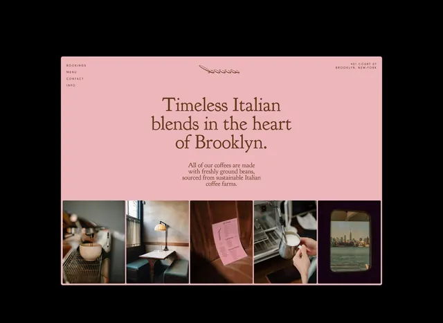
Coffee brand landing featuring centered italic serif type over blush pink with navigation links above and a five-image grid anchor below.
Summary
Italian coffee brand landing featuring centered italic serif type over blush pink with navigation links above and a five-image grid anchor below.
Visual description
Centered hero composition on warm blush-pink background. Top left shows small caps navigation: "BOOKINGS / MENU / CONTACT / INFO". Center upper area has a thin line logo. The main headline reads "Timeless Italian blends in the heart of Brooklyn" in large serif type, warm-brown color, centered. Below it, a three-line serif sub-copy in dark brown describes sourcing from sustainable Italian farms. Five photographs arranged horizontally at bottom anchor the fold: coffee cup, interior seating, menu card, pouring espresso, and city skyline view, each with subtle rounded-corner frame treatment and gentle shadow.
Key takeaway
The discipline of pairing italic serif copy (premium, literary) with photography that tells a sourcing story. A centered layout with navigation hanging above rather than integrated into a header. The color restraint: pastel pink + warm brown + black, avoiding the typical coffee-dark palette and signaling lifestyle over commodity.
Reuse notes
Works well for specialty food or beverage brands targeting a design-conscious audience. The pink background is directional, so keep it only if warmth and approachability are on-brand. The serif type + photo grid pattern pairs effectively with longer origin stories or multi-location concepts.
More like this
Keep what you find
A free account saves references to boards and can send you a weekly email of picks based on what you save.
To see every result, go Pro.