Preview image. Unlock full-res
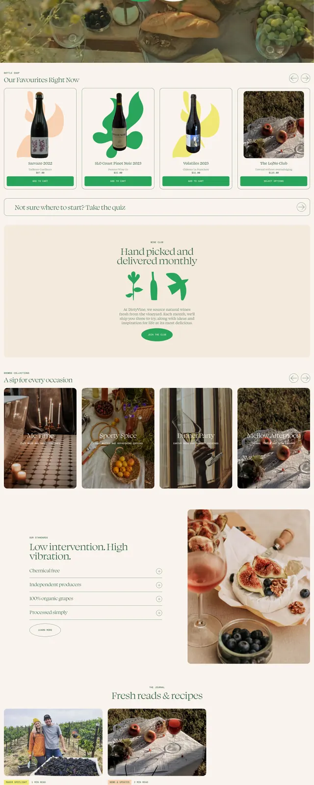
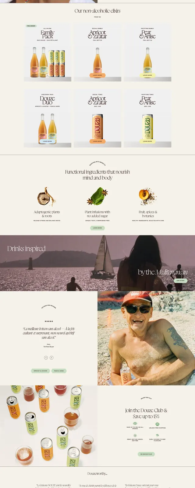
A luxury beverage homepage with oversized serif headlines, full-bleed photography, and cream-toned editorial sections.
Summary
A luxury beverage homepage with oversized serif headlines, full-bleed photography, and cream-toned editorial sections.
Visual description
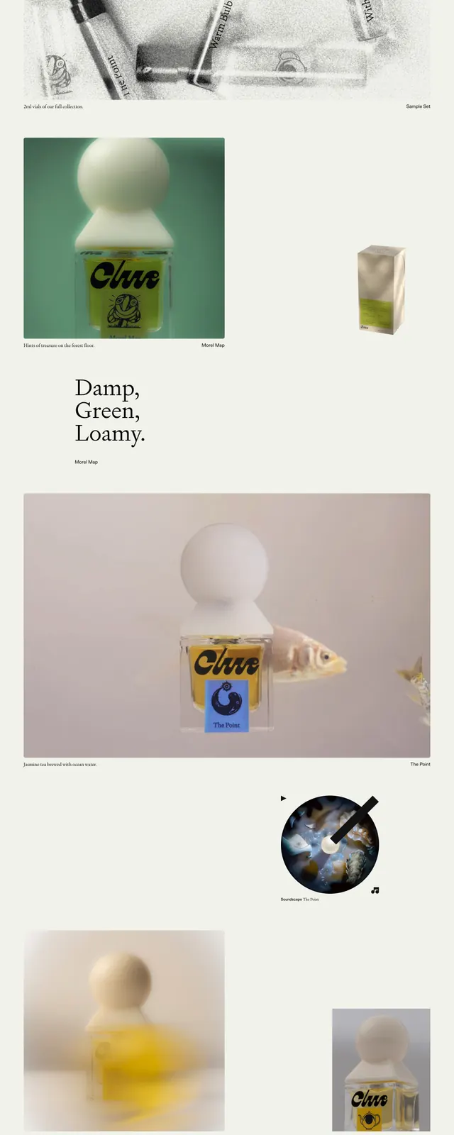
The page opens with a full-width hero image of cocktails and drinks photographed from above, topped by thin navigation and large italic serif copy. Below, the layout alternates between split image-and-text sections, ingredient feature blocks, testimonial-style content, and product/mix showcases on a soft cream background. The design uses elegant spacing, minimal UI chrome, and centered editorial typography throughout. A warm amber and blush palette reinforces the premium beverage branding.
Key takeaway
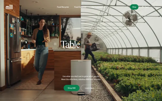
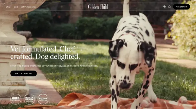
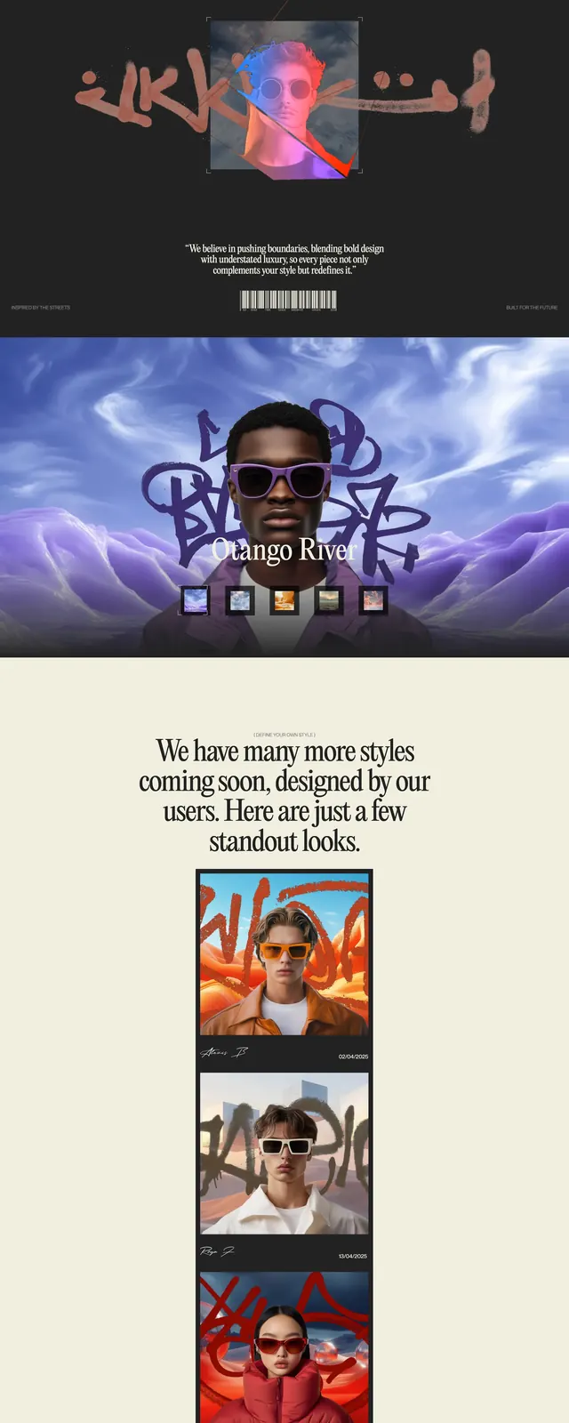
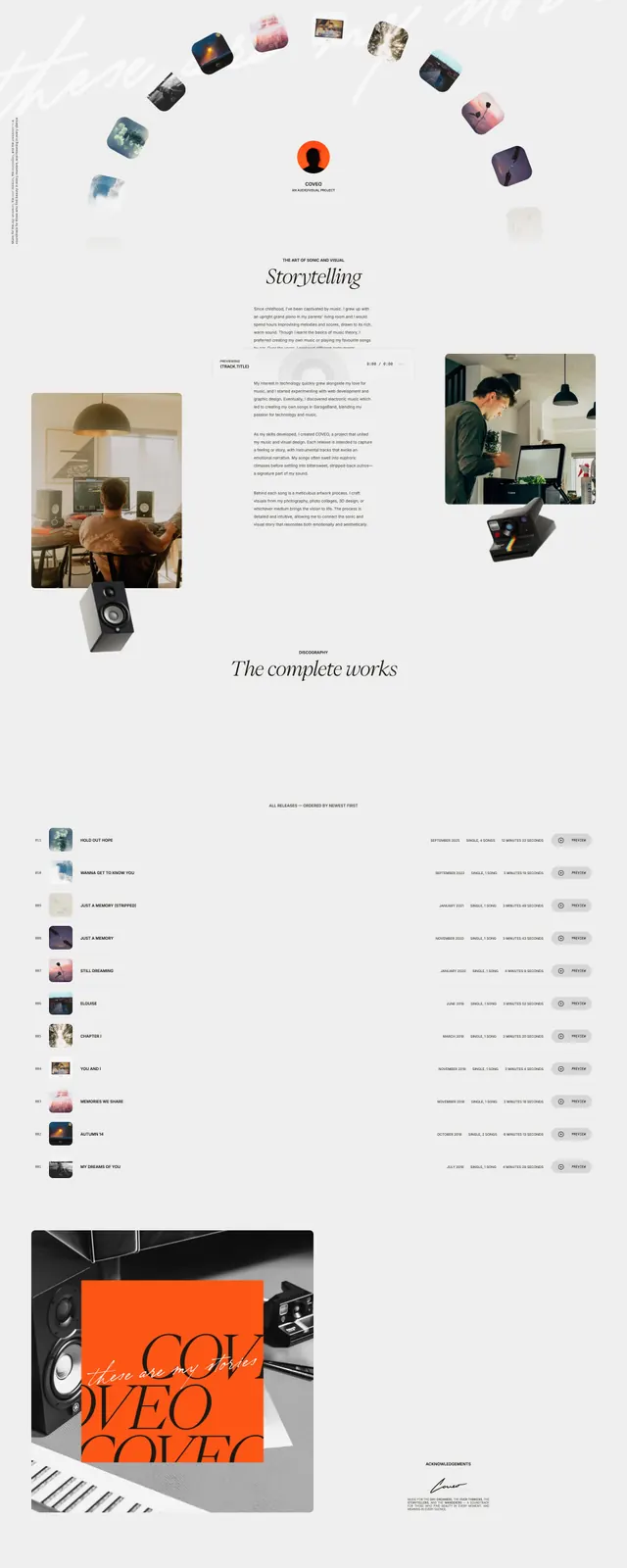
This is a strong reference for premium food or drink brands that want an editorial feel with minimal interface clutter. The combination of oversized serif type, soft neutral surfaces, and immersive photography creates a high-end lifestyle presentation.
Reuse notes
Reuse the stacked hero, split storytelling sections, and centered feature grids for a polished brand landing page. The style works best when copy is short and imagery is rich, letting typography and photography carry the narrative.