Preview image. Unlock full-res
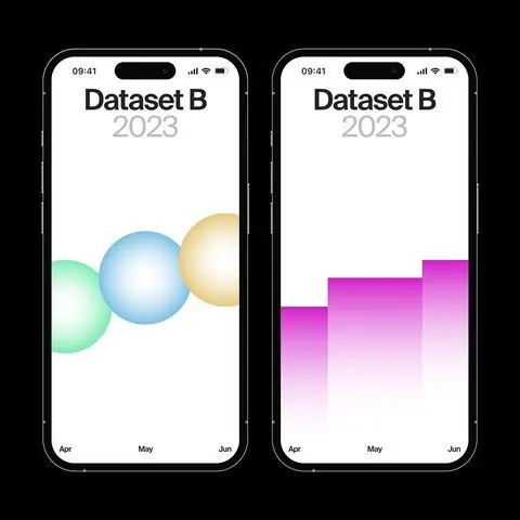
Two iPhone screens side-by-side comparing identical data: one rendered as gradient spheres, the other as ascending magenta bars.
Summary
Two iPhone screens side-by-side comparing identical data: one rendered as gradient spheres, the other as ascending magenta bars.
Visual description
Diptych mockup of two identical iPhones on black background. Left screen: white background with "Dataset B" header and "2023" subtitle in gray. Below, three overlapping spheres in soft 3D, each with a different pastel gradient (mint-green, cyan-blue, warm peach), labeled Apr/May/Jun at bottom. Right screen: same header, but data rendered as three ascending columns in vibrant magenta gradient (pale to hot pink), creating a modern bar-chart aesthetic. Both screens use status bar styling and minimal sans-serif typography. The composition emphasizes how identical three-point time-series data can be interpreted through distinct visual languages.
Key takeaway
Comparative visualization showing two valid design approaches to the same data set. The gradient sphere aesthetic reads as innovative and approachable; the bar chart is data-dense and analytical. Both techniques are light-background mobile-native, allowing the color and form to carry the meaning. The magenta gradient especially signals a contemporary, energetic data story.
Reuse notes
Use when comparing two visualization paradigms or when you need to pitch stylistic options for a dashboard. The sphere treatment works for exploratory or engagement-first dashboards; the bar treatment suits finance, analytics, or developer tools. Both work at iPhone scale; adapt column widths and sphere sizes for larger screens.
More like this


Keep what you find
A free account saves references to boards and can send you a weekly email of picks based on what you save.
To see every result, go Pro.