Preview image. Unlock full-res
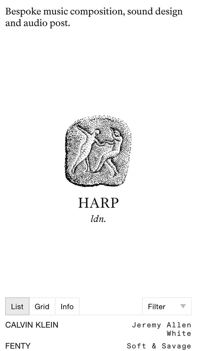
Stark monochromatic type specimen showcasing serif and sans-serif pairing with stippled portrait and aligned footer details.
Summary
A minimalist type specimen balancing serif display type with functional sans-serif, centered on a stippled portrait illustration and client-credit footer.
Visual description
Centered composition with "Bespoke music composition, sound design and audio post." set in serif display type at the top. Below, a dotted/stippled textured portrait of two figures in profile occupies the vertical center, rendered entirely in small black dots on white ground, creating texture and movement. Below the portrait, "HARP" appears in large serif capitals followed by "ldn." in italicized serif. Navigation controls (List, Grid, Info, Filter) are presented as minimal line-bordered buttons in a horizontal row. At the bottom, footer text aligns left (Calvin Klein / Jeremy Allen White, Fenty / Soft & Savage) pairing brand names with designer credits or product names in sans-serif. Ample white space between all elements reinforces precision and hierarchy.
Key takeaway
The stippled illustration technique adds visual interest and texture while remaining entirely monochromatic and printable. Serif display type conveys editorial weight and cultural credibility for music/creative contexts. The footer credit structure (brand + name on left, descriptor on right) is a legible pattern for portfolio portfolios or museum credits. Navigation as minimal bordered buttons maintains the sparse aesthetic without sacrificing scannability.
Reuse notes
Excellent for music, art direction, design portfolio, or cultural institution collateral. The type pairing (serif headline with sans-serif functional elements) is broadly applicable. The stippled portrait style works well for portraits at medium-to-large scale but may lose detail if reduced. Best suited to print or high-res digital contexts where dot texture is visible. Client-name pairing at the footer is typical for high-end creative services.
More like this





Keep what you find
A free account saves references to boards and can send you a weekly email of picks based on what you save.
To see every result, go Pro.