Preview image. Unlock full-res
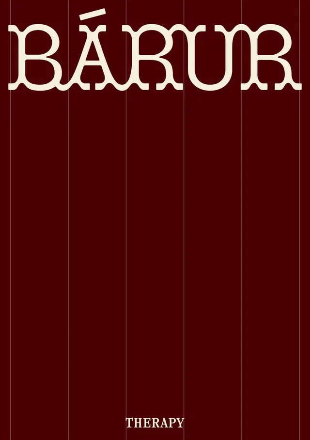
Bold outlined sans-serif wordmark anchored by a dark warm palette and gridded layout structure.
Summary
Outlined geometric sans-serif wordmark "BARUR" on a dark burgundy ground with thin vertical grid lines, anchored by "THERAPY" in sans-serif at the base.
Visual description
A cream-white outlined sans-serif wordmark "BARUR" dominates the composition against a deep burgundy background. The letters are wide, slightly condensed, and rendered as outlines with consistent stroke weight. Thin vertical lines segment the field into regular columns across the full height. The word "THERAPY" appears centered at the bottom in a smaller all-caps sans-serif, maintaining the same cream-white outline style. The grid and centered axis reinforce a sense of structure and precision. The warm burgundy-to-cream contrast is high and legible.
Key takeaway
The outlined-type approach gives weight without blocking the background's grid texture. Centering a descriptive secondary word at the base creates visual narrative (wordmark + category) without hierarchy discord. The gridded background subtext suggests order and systematization, useful for wellness or technical brands.
Reuse notes
Strong for health, wellness, or therapy-focused identities seeking a contemporary but professional feel. The outlined style reads well at various scales. Works best on dark backgrounds that allow the cream stroke to pop. The warm-tone palette leans premium and calm.
More like this




Keep what you find
A free account saves references to boards and can send you a weekly email of picks based on what you save.
To see every result, go Pro.