Preview image. Unlock full-res
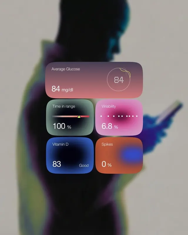
Health-tracking dashboard interface featuring six metric cards with glassmorphism effect and gradient backgrounds, overlaid on a blurred human silhouette.
Summary
Health dashboard UI displaying six metric cards (Average Glucose, Time in Range, Variability, Vitamin D, Spikes) with translucent glassmorphic treatment and gradient fills, positioned over a bokeh-blurred human profile silhouette.
Visual description
Portrait-oriented composition with heavily blurred background showing a human silhouette rendered in soft, colorful bokeh (teal, purple, yellow-green gradients). Foreground contains six metric cards arranged in a loose grid: top card (dusty-rose gradient) shows "Average Glucose" with a value of 84 mg/dl and circular progress indicator. Below are two cards side-by-side: left is "Time in range" (teal-to-neutral gradient) with 100% and a slider visualization; right is "Variability" (pink-magenta gradient) with 6.8% and dot-pattern indicator. Bottom row repeats the pattern with "Vitamin D" (deep-blue gradient) showing 83 with "Good" label, and "Spikes" (coral-to-orange gradient) showing 0%. Each card uses white sans-serif type with clear hierarchy between labels and numeric values. Cards have soft drop shadows and frosted-glass transparency against the background blur.
Key takeaway
The glassmorphic treatment makes dense health data feel approachable and modern rather than clinical. The color-per-metric system (different gradient per KPI) enables quick visual scanning while the translucent cards feel cohesive. Blurred background adds depth and softness without being distracting; the silhouette reinforces the health/body focus.
Reuse notes
Strong pattern for health, fitness, or wellness apps targeting consumer audiences. The gradient-per-metric approach scales well up to 8-12 KPIs but becomes noisy beyond that. Works best on dark or image backgrounds where the frosted-glass effect reads clearly. Avoid on white backgrounds where the transparency becomes invisible.
More like this




Keep what you find
A free account saves references to boards and can send you a weekly email of picks based on what you save.
To see every result, go Pro.