Preview image. Unlock full-res
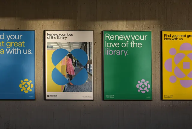
A set of four public-library campaign posters pairing bold color blocks with documentary photography and geometric icon marks.
Summary
Four public-library campaign posters using saturated color blocks (deep teal, warm yellow, forest green, cobalt blue) with documentary photography and repeating geometric icons to promote library engagement and renewal.
Visual description
Each poster anchors on a large color field: deep forest green, bright mustard yellow, rich teal, or cobalt blue. On the teal and yellow posters, a candid library interior photograph of a visitor wearing warm colors sits centered within the block, creating a figure-ground relationship. The green and blue posters instead feature complementary geometric icon marks (stylized flowers or radiant shapes) in a contrasting yellow. White sans-serif headlines in medium weight sit at the top of each ("Renew your love of the library", "Find your next great read with us"), with supporting white text below. Small logo lockups and credit lines appear in the bottom corners. The posters are mounted flush against a wood-grain wall, showing equal visual weight and clear typographic hierarchy across the series.
Key takeaway
The use of saturated single-color backgrounds paired with a modest documentary photograph to create approachability without clutter. The repeating geometric icon system (appearing on the poster variants without photography) provides flexible visual consistency across the campaign. The high contrast of white type on dark color achieves legibility at distance while maintaining a premium, institutional aesthetic.
Reuse notes
Well-suited to public institutions, nonprofits, or educational campaigns where warmth and accessibility are central. The color-blocking and geometric iconography scale to wayfinding, posters, and digital promotions. Avoid on light backgrounds without significant contrast adjustment. Works best when the campaign maintains consistent color assignment per message.
More like this


Keep what you find
A free account saves references to boards and can send you a weekly email of picks based on what you save.
To see every result, go Pro.