Preview image. Unlock full-res
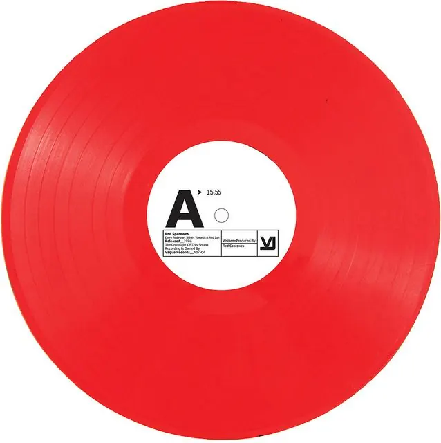
A minimalist vinyl record label design pairing a bright red disc with a clean white center label and bold black sans-serif letterform.
Summary
A minimal vinyl record label pairing a bright red disc with a white center label featuring a bold sans-serif A-mark and metadata text in a compact, functional layout.
Visual description
A bright red vinyl record photographed at full face, showing the album surface with subtle groove details along the left edge. The white center label is positioned concentrically with a large bold sans-serif "A" letterform (roughly 2/3 the label diameter) in black. Below the mark sit three small metadata blocks in fine black sans-serif: a catalog or reference number (15.55), a small circle icon, and a grid of text boxes containing copyright, production, and label information. The stark red-and-white palette creates maximum visual contrast and readability at any scale.
Key takeaway
The discipline of a single dominant letterform centered on a white field, with supporting metadata tucked neatly into modular text blocks. Bright, saturated primary color against white drives recognition and durability across production runs and photo documentation. The use of grid-based information architecture keeps the label functional and legible despite dense small type.
Reuse notes
Use for any print vinyl, cassette, or physical media label where a single mark or initial is the brand identity. Works equally well as a packaging reference or as a template for music-production identity systems. The high contrast and centered symmetry read well at thumbnail scale and in low-resolution reproductions.
More like this









Keep what you find
A free account saves references to boards and can send you a weekly email of picks based on what you save.
To see every result, go Pro.