Preview image. Unlock full-res
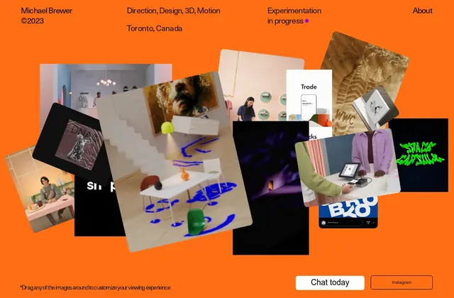
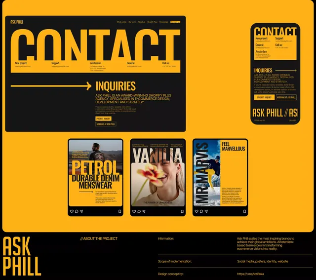
Portfolio design featuring overlapping project thumbnails (photography, 3D renders, print) anchored by a vibrant orange accent band with minimal text.
Summary
Creative studio portfolio layout showing overlapping project thumbnails (photography, 3D work, printed matter) with a bold vibrant orange accent strip separating sections.
Visual description
A layered, asymmetric composition displaying a variety of creative outputs in thumbnail form: black and white photography, colorful 3D rendered objects, printed posters, and design mockups, all partially obscured by overlap. A vibrant orange horizontal band cuts diagonally across the middle of the composition, containing minimal navigation text and visual labels. The background is black or very dark, allowing the varied project imagery and the warm orange accent to stand out. The overlaps are intentional and irregular, creating visual tension and suggesting a curated collection being flipped through or arranged. A warm, neutral color palette of taupes, creams, and dark browns supports the photography and print elements, contrasting with the single saturated accent color. Small sans-serif text labels and navigation hints sit within and adjacent to the orange band.
Key takeaway
The use of a single vibrant accent color (orange) to unify and navigate a visually complex layout of disparate project types. The intentional overlapping creates energy without requiring animation or interactivity. The restraint in typography and layout structure keeps the focus on the work itself rather than designer ego.
Reuse notes
Strong reference for multidisciplinary creative studios, agencies, and designer portfolios showcasing varied work (photography, 3D, print, digital). The overlapping grid works best when projects have rich, distinct visual identities. Works effectively as a landing or hero section. Note that the layout benefits from a dark background; the same approach would feel chaotic on white. Good pairing with motion/hover states that reveal or animate individual project cards.
More like this


Keep what you find
A free account saves references to boards and can send you a weekly email of picks based on what you save.
To see every result, go Pro.