Preview image. Unlock full-res
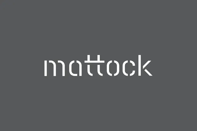
Monochromatic wordmark with geometric sans-serif letterforms and distinctive crossbar detail on dark gray background.
Summary
Monochromatic wordmark with geometric sans-serif letterforms featuring a distinctive horizontal crossbar integrated into the letterforms, centered on a dark gray background.
Visual description
A simple, centered wordmark on a solid dark gray background. The word "mattock" is rendered in white in a narrow geometric sans-serif typeface with consistent stroke weight. The letterforms are clean and modular. Notably, several characters feature a distinctive horizontal stroke or crossbar element that cuts through or sits above the baseline letters, creating a grid-like integration with the type. The overall effect is minimal and geometric, with the crossbar motif serving as both a decorative and identity-building feature. No additional elements, imagery, or color; pure type on background.
Key takeaway
The crossbar motif integrated across the letterforms creates a memorable visual signature while maintaining legibility. Using a single geometric element as a unifying design principle across the wordmark gives it personality without ornamentation. The monochromatic approach on a single background color is timeless and works at any scale.
Reuse notes
Ideal for tech, SaaS, or B2B brands seeking a clean, contemporary identity that will scale well from favicon to billboard. The geometric sans-serif and monochrome palette convey trustworthiness and clarity. The crossbar detail provides enough distinctiveness to avoid generic wordmark syndrome. Best applied to brands where the wordmark appears primarily in digital or light contexts; the white-on-dark palette works for dark interfaces or screens but may need inversion for print on light paper.
More like this


Keep what you find
A free account saves references to boards and can send you a weekly email of picks based on what you save.
To see every result, go Pro.