Preview image. Unlock full-res
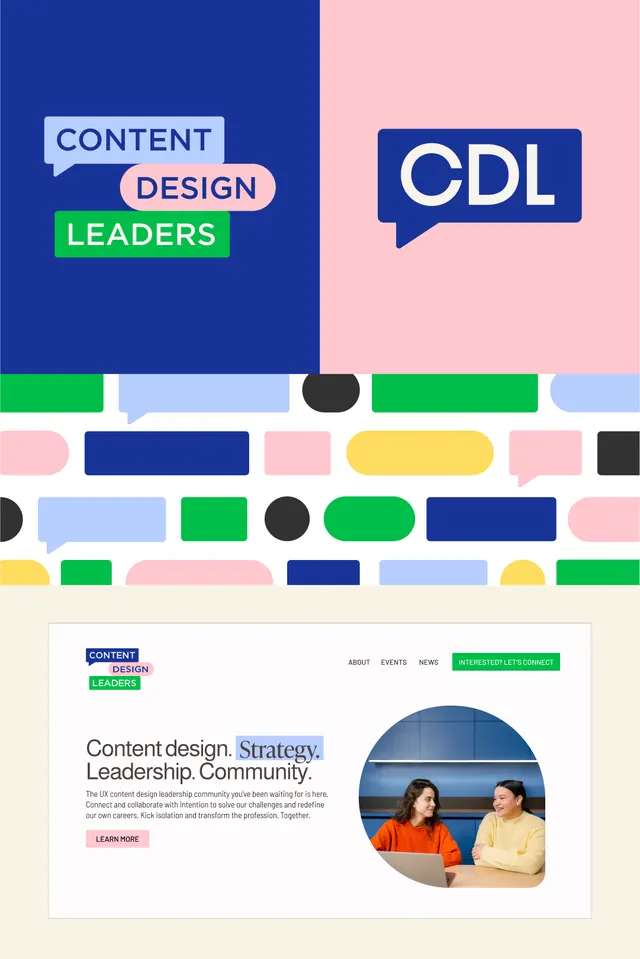
A vibrant brand identity with bold color-blocked speech bubbles and horizontal bars showcasing three tagline elements and a website layout mockup.
Summary
A vibrant brand identity system for Content Design Leaders with bold primary blue, lime green, and pink accents using color-blocked speech bubbles and modular geometric shapes.
Visual description
The composition shows three distinct parts: top section features a split background (bright primary blue on left, soft pink on right) with three overlapping speech bubbles containing stacked text "CONTENT / DESIGN / LEADERS" in sans-serif, establishing visual hierarchy. A centered section displays a horizontal collection of colored rectangular and circular bars in navy, light blue, bright green, pink, yellow, black, and light blue, arranged in a loose grid pattern. Below sits a beige container mockup with the brand mark repeated, navigation links (ABOUT, EVENTS, NEWS), and a call-to-action button in bright lime green. A circular photo shows two people in conversation, positioned right of center.
Key takeaway
The modular color-palette system: distinct blocks of saturated color (navy, lime, pink) used consistently across graphic elements and UI creates instant brand recognition without requiring a single complex illustration. The speech-bubble treatment of typography adds personality and implied communication. The layered color bars function as a flexible pattern asset that scales across scales and applications.
Reuse notes
Strong reference for brand systems that need bold, friendly confidence alongside professional credibility. The speech-bubble motif works well for communication-focused brands (platforms, content, collaboration tools). Color relationships are clearly legible even at small scale due to high contrast; avoid on muted or saturated backgrounds.
More like this
Keep what you find
A free account saves references to boards and can send you a weekly email of picks based on what you save.
To see every result, go Pro.