Preview image. Unlock full-res
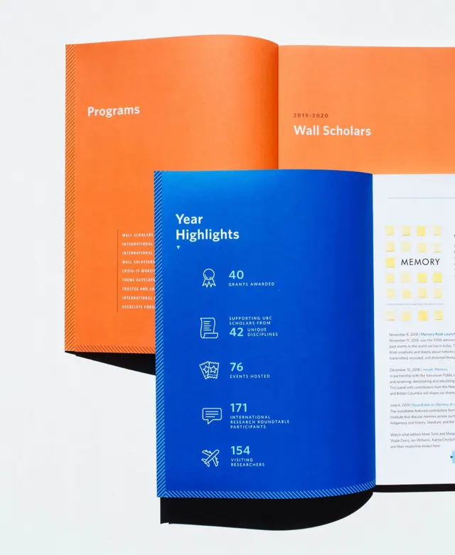
A tri-panel annual report mockup with overlapping orange and blue panels displaying program statistics and institutional achievements.
Summary
A tri-panel annual report mockup with overlapping orange and blue panels displaying program statistics and institutional achievements.
Visual description
Three overlapping rectangular panels form the composition: a warm orange panel on the left labeled "Programs" and "Wall Scholars", a vibrant deep blue center panel titled "Year Highlights" featuring white icon-based metrics (12, 40, 76, 18+), and a light gray right panel titled "MEMORY". The layered arrangement creates depth through physical overlap, with black curved accents anchoring the bottom. Typography is clean sans-serif throughout, with all-caps labels. Color contrast between the warm orange and cool blue reads as complementary and energetic.
Key takeaway
The overlapping-panel technique creates visual depth without actual 3D. Icon-plus-number formatting is compact and scannable for key metrics. The complementary orange-blue palette with neutral gray reads as both institutional and modern.
Reuse notes
Strong for annual reports, program overviews, or institutional communications (nonprofits, higher education, foundations). The color scheme is bold enough to command attention but stays professional. Works best when metrics are few enough to stay readable.
More like this


Keep what you find
A free account saves references to boards and can send you a weekly email of picks based on what you save.
To see every result, go Pro.