Preview image. Unlock full-res
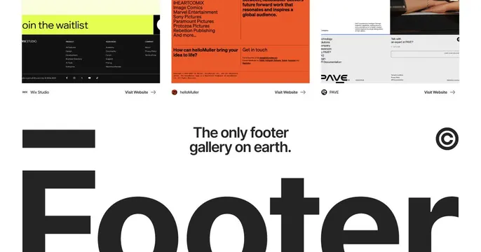
Portfolio showcase grid displaying three footer design variations with different visual treatments, brand identities, and color approaches.
Summary
Portfolio showcase displaying three footer design variations with distinct color and typographic strategies from different studios and brands.
Visual description
Three footer sections arranged horizontally: Left footer (Wix Studio) on cream background with dark navigation columns and social icons. Center footer (helloMuller) on bright orange background with bold sans-serif headings "How can helloMuller bring your idea to life?" and smaller body copy in black. Right footer (PAVE) on light background with minimal sans-serif type, horizontal rule dividers, and narrow column layout. Each section shows different strategies for footer hierarchy: vertical-column navigation, bold question-driven content, and minimalist sparse layout. Brand logos and call-to-action links ("Visit Website" with arrow) appear below each section. Below all three sits a wide typographic treatment: "The only footer gallery on earth" in dark sans-serif centered on white, with a copyright symbol on the right and partial large letter "F" (from "Footer") at bottom-left.
Key takeaway
Three distinct footer patterns showing the range of approaches available: information-dense columnar (navigation first), question-driven marketing (brand voice first), and minimalist sparse (content-respecting). The three-in-one comparison format itself is a strong portfolio presentation tactic. The tagline below anchors the message and adds personality.
Reuse notes
Study each footer style separately for different project needs. The orange-on-black helloMuller style suits projects wanting boldness and marketing push. The Wix minimal approach fits technical or neutral brands. PAVE's layout-focused style works well for sparse, content-light projects. The portfolio-display format itself is ideal for showcasing design range to potential clients.
More like this








Keep what you find
A free account saves references to boards and can send you a weekly email of picks based on what you save.
To see every result, go Pro.