Preview image. Unlock full-res
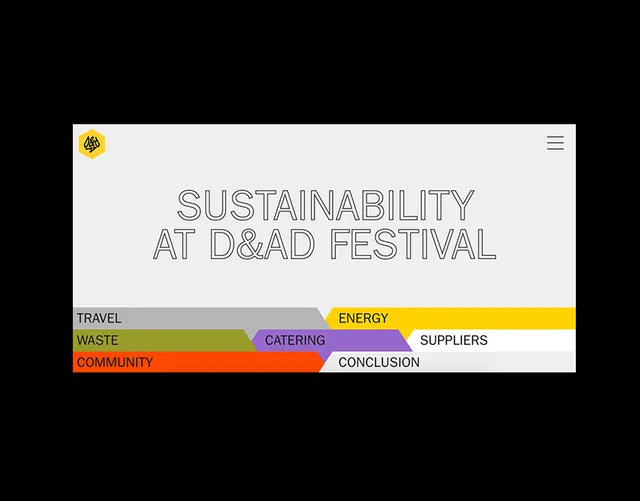
A festival page header with outlined headline type and a segmented horizontal bar layout breaking sustainability topics into color-coded strips.
Summary
A festival page header with outlined headline type and a segmented horizontal bar layout breaking sustainability topics into color-coded strips.
Visual description
Light gray hero section anchored by a yellow circular logo in the top-left corner and a hamburger menu. The hero features a large outlined sans-serif headline reading "SUSTAINABILITY AT D&AD FESTIVAL" in a display-weight font. Below sits an abstract information architecture: five overlapping horizontal color bars (gray, green, orange, purple, and white) carrying labels like TRAVEL, WASTE, COMMUNITY, ENERGY, CATERING, SUPPLIERS, and CONCLUSION. Each bar is angled slightly to create visual dynamism and allow text from multiple bars to coexist without overlap. The color palette is muted and warm overall, with occasional accent colors for emphasis.
Key takeaway
Horizontal segmented bars work well to break large categories into digestible chunks while staying visually cohesive. Color-coding sections (one hue per topic) aids scannability. Overlapping and angling bars prevents the layout from feeling static. Outlined type paired with full-color supporting graphics creates a strong visual hierarchy.
Reuse notes
Excellent for event or festival pages, sustainability reports, or any multi-faceted program needing visual organization. The modular bar system scales well if you need to add or remove sections. Works best with 5-8 categories; beyond that, readability drops. The pastel-muted color approach keeps the design feeling sophisticated rather than juvenile.
More like this



Keep what you find
A free account saves references to boards and can send you a weekly email of picks based on what you save.
To see every result, go Pro.