Preview image. Unlock full-res
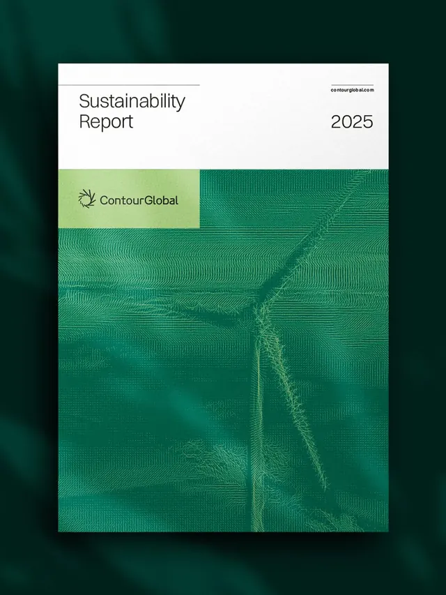
Sustainability report cover combining a clean white header with a bold emerald-to-lime gradient wave pattern suggesting growth and environmental vitality.
Summary
A sustainability report cover pairing a stark white header zone with an expansive emerald-to-lime animated wave pattern that fills the lower two-thirds, conveying environmental growth and responsibility.
Visual description
The composition divides into two zones: a clean white upper section with minimal typography (title "Sustainability Report", year "2025", and a small contact email in the corner) and the Contour Global logo in a soft lime accent band; the lower two-thirds explodes into a layered emerald and teal gradient with a dense, flowing wave topography that suggests organic growth, water flow, or landscape contours. The wave pattern is built from thin horizontal lines that curve and undulate, creating visual depth and movement while staying firmly abstract. The color shift from deep forest teal at the bottom through mid-tone emerald and up to bright lime creates a vibrancy that reads as fresh and optimistic despite the serious subject matter.
Key takeaway
The zone-based split: stark minimum-information header that anchors the brand, then a full-bleed visual statement below that carries the emotional weight. The wave topology pattern built from line layers rather than filled shapes, allowing for subtlety and sophistication. The cool-toned gradient progression that implies growth or elevation without relying on photo or illustration.
Reuse notes
Strong fit for ESG/sustainability/environmental reports, annual reports, and corporate communications where you want to convey trustworthiness and environmental commitment without being heavy-handed. Works best with plenty of breathing room around the cover and a clean typeface. The pattern can feel overwhelming in small applications, so reserve this for front covers or large poster formats. Pairs well with minimal sans-serif type and plenty of white space in the accompanying interior spreads.
More like this



Keep what you find
A free account saves references to boards and can send you a weekly email of picks based on what you save.
To see every result, go Pro.