Preview image. Unlock full-res
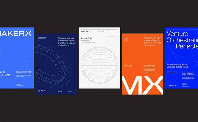
Presentation deck using alternating deep blue and bright orange slides with geometric diagrams and bold typography for venture capital positioning.
Summary
A multi-slide deck system anchored by a blue-and-orange color scheme, using geometric diagrams on blue slides and bold typography on orange to communicate venture growth narratives.
Visual description
Five presentation slides arranged horizontally. Alternating backgrounds in deep royal blue (hex #111C58/#3A6DFC) and bright burnt orange (hex #F65B18) create rhythmic visual contrast. Blue slides feature thin-line geometric wireframe diagrams (arcs, grids, abstract network shapes) with white typography and the MakerX logo. Orange slides display large white sans-serif headlines and body copy set in generous spacing against solid color, with minimal imagery. All slides use the same sans-serif display typeface, creating typographic consistency across the alternation. White and light-gray text maintains high contrast throughout.
Key takeaway
The two-color system as a structural device: alternation prevents monotony and can signal different content types (blue for research/method, orange for narrative/ask). Geometric diagrams on the darker side convey complexity and precision; solid color on bright provides breathing room for message clarity. The complementary blue-orange pairing reads as energetic and tech-forward without feeling chaotic.
Reuse notes
Highly effective for venture pitches, innovation presentations, and multi-phase growth stories. The alternation structure scales well to 10+ slides while maintaining visual rhythm. Requires bold, legible headlines; fine details in the wireframe diagrams may lose impact in small formats. The blue-orange palette has become associated with startup / fintech / innovation verticals; use elsewhere only if the positioning warrants.
More like this



Keep what you find
A free account saves references to boards and can send you a weekly email of picks based on what you save.
To see every result, go Pro.