Preview image. Unlock full-res
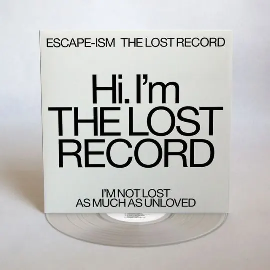
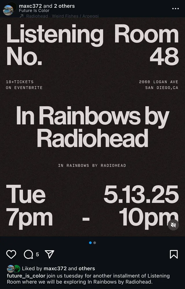
Album artwork with oversized sans-serif headline and smaller supporting text, using stark black-and-white contrast and generous whitespace to isolate typography as the primary visual.
Summary
Album jacket pairing a large display headline with compact secondary text, using pure black-and-white printing on a clear sleeve to foreground typography alone.
Visual description
A clear plastic sleeve containing white printed card stock. The layout is vertically centered with a small uppercase label at top ("ESCAPE-ISM THE LOST RECORD"), followed by a large sans-serif headline spanning multiple lines ("Hi. I'm THE LOST RECORD") in black, then body-copy statements below in a smaller, tighter size. A vinyl disc visible through the clear sleeve at the bottom. The entire design relies on scale relationships, line length, and silence to create emphasis and readability.
Key takeaway
The use of scale contrast—a multi-line large headline next to tight, subordinate body text—to create instant visual hierarchy without color or additional graphics. The clear sleeve as a frame, letting the disc itself become a design element. The confident use of negative space and a single typeface at multiple sizes to convey quiet authority.
Reuse notes
Strong reference for music, media, and culture brands that need restraint and clarity. Works particularly well for independent labels or curated collections where typography carries the entire narrative. The clear sleeve approach is production-specific but translates to digital layouts favoring whitespace and type-as-image.
More like this

Keep what you find
A free account saves references to boards and can send you a weekly email of picks based on what you save.
To see every result, go Pro.