Preview image. Unlock full-res
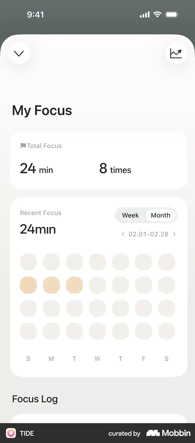
A mobile focus-tracking app screen showing time metrics in rounded cards, a calendar heatmap, and period-range toggle in a minimal neutral palette.
Summary
A mobile app screen for a focus-tracking tool displaying session metrics, a calendar heatmap of activity, and toggle controls for time period selection in a minimalist interface.
Visual description
The screen displays a "My Focus" header centered at top, with a small chevron button on the left and a chart icon on the right. Below sits a rounded card showing "Total Focus" metrics: bold large numerals (24 min, 8 times) stacked horizontally. A second section shows "Recent Focus" with a large "24min" value and Week/Month toggle buttons in soft gray. The calendar heatmap beneath displays 28 days in a 7-column grid: circles range from light gray (no activity) to warm tan (activity recorded). Day-of-week labels sit below. A "Focus Log" label marks the bottom of the visible frame. The color palette is light (near-white background) with dark gray text and accents, rounded corners on all interactive elements, and generous whitespace.
Key takeaway
The metric cards use large numerals with small descriptive labels below, making data scannable at a glance. The calendar heatmap as a circular-dot grid is space-efficient and visually approachable. The toggle control (Week/Month) uses button styling to make time-range switching obvious without extra chrome.
Reuse notes
Strong pattern for any productivity, analytics, or time-tracking mobile interface. The color scheme and rounded corners suit wellness or lifestyle apps. The heatmap pattern works for streak-based or habit-tracking visualizations. Requires legible type to work at smartphone scale.