Preview image. Unlock full-res
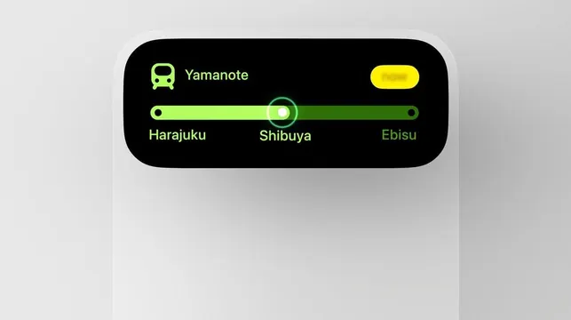
Minimal transit-app interface displaying a Tokyo train line with stations and live-position slider, using lime-green accents on black and light gray.
Summary
A public-transit UI widget (Yamanote line, Tokyo) showing three stations with a lime-green position slider on a black background, optimized for mobile glanceability.
Visual description
Black rounded rectangle containing the app icon (small car silhouette in lime green), app name "Yamanote" in white, and a horizontal track displaying three station names (Harajuku, Shibuya, Ebisu) in lime green. A white circular slider sits at the center position (Shibuya) with a green ring overlay. Small yellow oval (possibly a notification badge) in the top-right corner. The overall container floats on a neutral light-gray background. Typeface is clean, modern sans-serif. High contrast between the black UI panel and light-gray ground; lime-green accents provide the only color variation.
Key takeaway
Extreme clarity through high contrast and negative space. A single accent color (lime green) is enough to guide attention to the interactive element (slider) without visual noise. The station labels are easily readable and scannable. The rounded-rectangle container with breathing room around it communicates "discrete widget" without borders or drop shadows.
Reuse notes
Ideal template for any real-time status or navigation interface (transit, delivery tracking, live location). The monochrome plus single accent approach works at small sizes and on bright or dark backgrounds. Clean, accessible design suitable for mobile apps requiring fast information lookup. Best used when showing live or changing data (current location, status, position).
More like this
Keep what you find
A free account saves references to boards and can send you a weekly email of picks based on what you save.
To see every result, go Pro.