Preview image. Unlock full-res
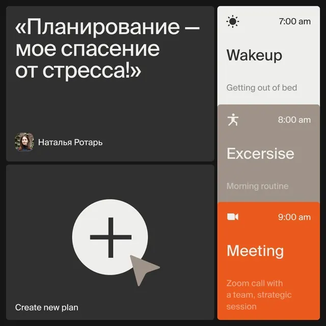
Productivity timeline UI pairing dark messaging with a light task-list sidebar, using warm tan and orange accents.
Summary
A two-column layout that anchors planning motivation (a prominent quote on the left) with an actionable timeline on the right, using a burnt-orange button to drive task creation.
Visual description
Left panel on a very dark gray background displays a large Russian quotation in white caps, followed by a small circular user avatar and name attribution. Below sits a white-on-dark "Create new plan" button above a large white "+" symbol in a light circle. Right panel uses light off-white and warm tan backgrounds to show a vertically stacked task list with times (7:00 am Wakeup, 8:00 am Exercise in a tan section, 9:00 am Meeting in bright burnt orange), each with a small icon and muted gray subtitle. The orange accent pulls the eye to the scheduled meeting. Composition emphasizes symmetry and clean card separation.
Key takeaway
The warm color temperature break (tan and orange) used to elevate secondary content without adding complexity. The split layout that pairs motivational text with a functional list, letting each side carry different cognitive load. The orange accent on the highest-priority item acts as both visual hierarchy and affective cue.
Reuse notes
Effective for morning-routine or wellness apps where motivation pairs with task execution. The orange accent works best on dark backgrounds and should highlight primary actions only. Two-column layout reads well on desktop but requires responsive stacking on mobile.
More like this


Keep what you find
A free account saves references to boards and can send you a weekly email of picks based on what you save.
To see every result, go Pro.